Helping College Instructors Improve Teaching While Building Courses
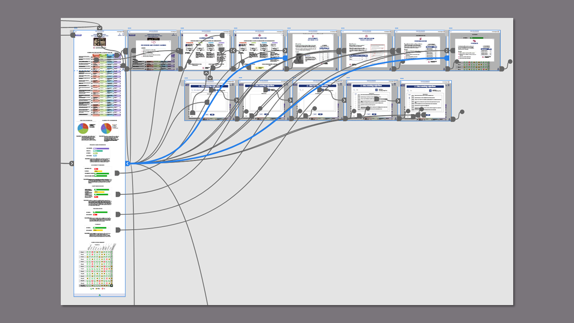
Course Design Overview Flow Design
Project Overview
Argos Education is an EdTech startup that launched in 2021 to disrupt the traditional idea of postsecondary textbooks. Their goal is to give control of course design back to educators by creating a platform that provides content, tools, and support while keeping student costs low with their Sojourner Platform. They were running beta versions of the platform during this project but kept it private as they were looking for a fresh perspective.
The Client
Post-secondary instructors are experts in their fields but don't receive training in learning science or best teaching practices. On top of their roles as educators, they are saddled with learning new course management software so there is no time for professional development.
The Problem
Acting as project manager for a team of four, I facilitated meetings, led client communication, and scoped work for the team.
My partner and I took the lead in completing all phases of generative and evaluative research, including reporting, recommendations, and next steps.
I worked independently on researching learning science and communicating with the client to develop the course design overview flow which would become their unique value proposition.
My partner and I worked collaboratively on the hi-fi prototypes. He built the course creation flow and quiz flow while I created the activity flow and course design overview flows.
My Role
Early-stage realization and validation of client's first-to-market learning design feature. The clients said, "You've definitely expanded our thinking about something we've been struggling with."
Outcome
Our team received the project brief on January 29, 2022 and delivered the final presentation and prototype on March 29, 2022.
Timeline
Competitive/ Comparative Analysis
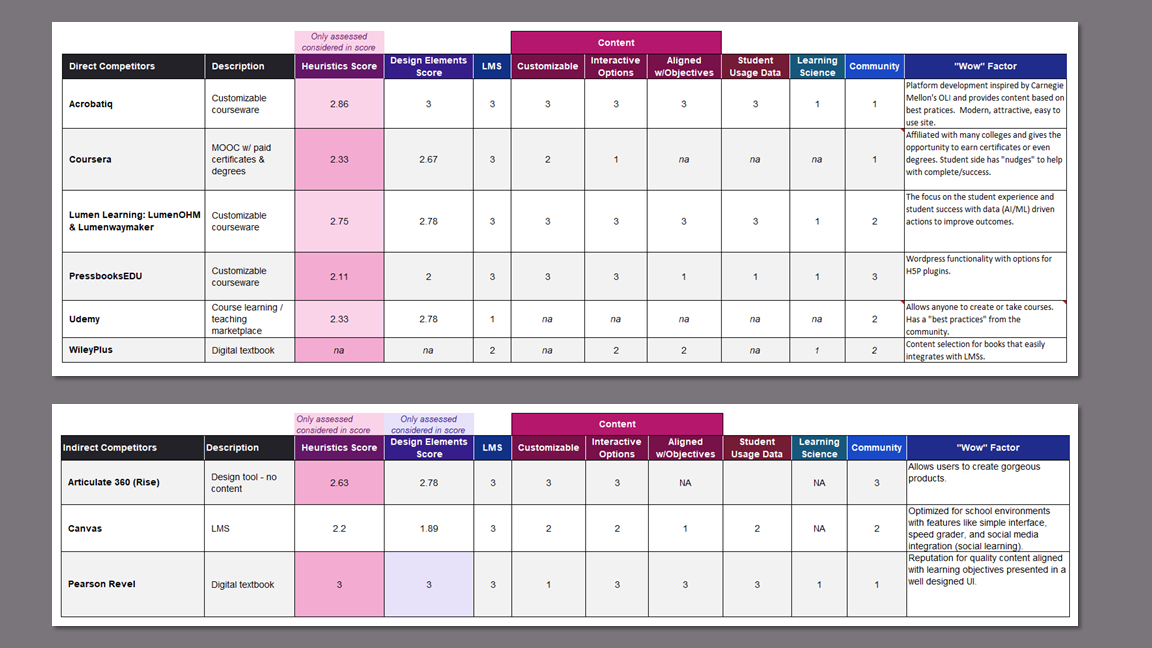
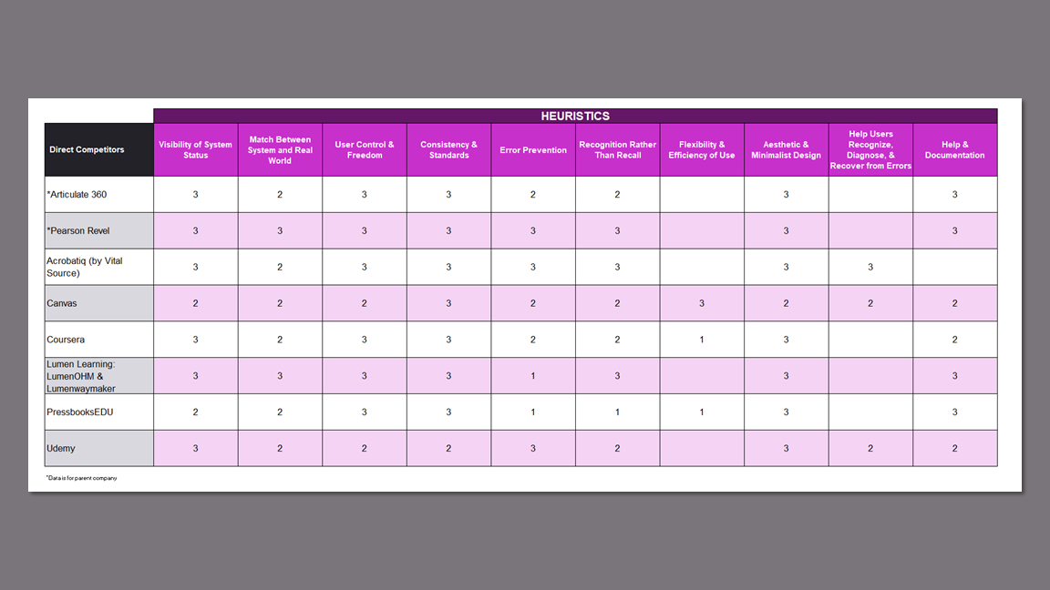
We completed a features and heuristics analysis on 8 competitors via webinars, demos, and instructional videos on YouTube because institutional affiliation was required for direct access.
Give Argos an edge by providing superior usability.
Know the EdTech market to inform design decisions.
Gain a better understanding of the product.
Research Goals
Findings
Existing Features in Market
None of the competitors educate their users on best teaching practices.
No competitors provide design analytics to help instructors build courses that maximize student engagement and success.
Only a few competitors provide a marketplace for users to earn money from the courses they create.
Most sites use educational jargon that confuses and frustrates users.
Customizable Software
Customization is limited to the user's ability to hide or show content, choose media, or decide the order of the content.
The design environment is very rigid, which doesn't allow more tech savvy users the option to truly customize their courses.
Few tools are provided to build bespoke content.
Takeaways
Understanding the products our participants use helped us write effective screener surveys and informed our interviews.
The standard layouts of the platforms gave us a starting point for design since the product was new rather than a redesign.
The features analysis confirmed that organic integration of learning science and professional development does not exist in the market.
User Research
I conducted four of the five 60-minute interviews with university professors and instructional designers via Zoom. The screener survey included questions about their experience with other platforms and their confidence with technology.
Understand pain points, emotion/engagement in course building process, tedious tasks vs. high value tasks.
Current knowledge and practice of learning science.
Current data access and wishes.
Comfort with technology.
Research Goals
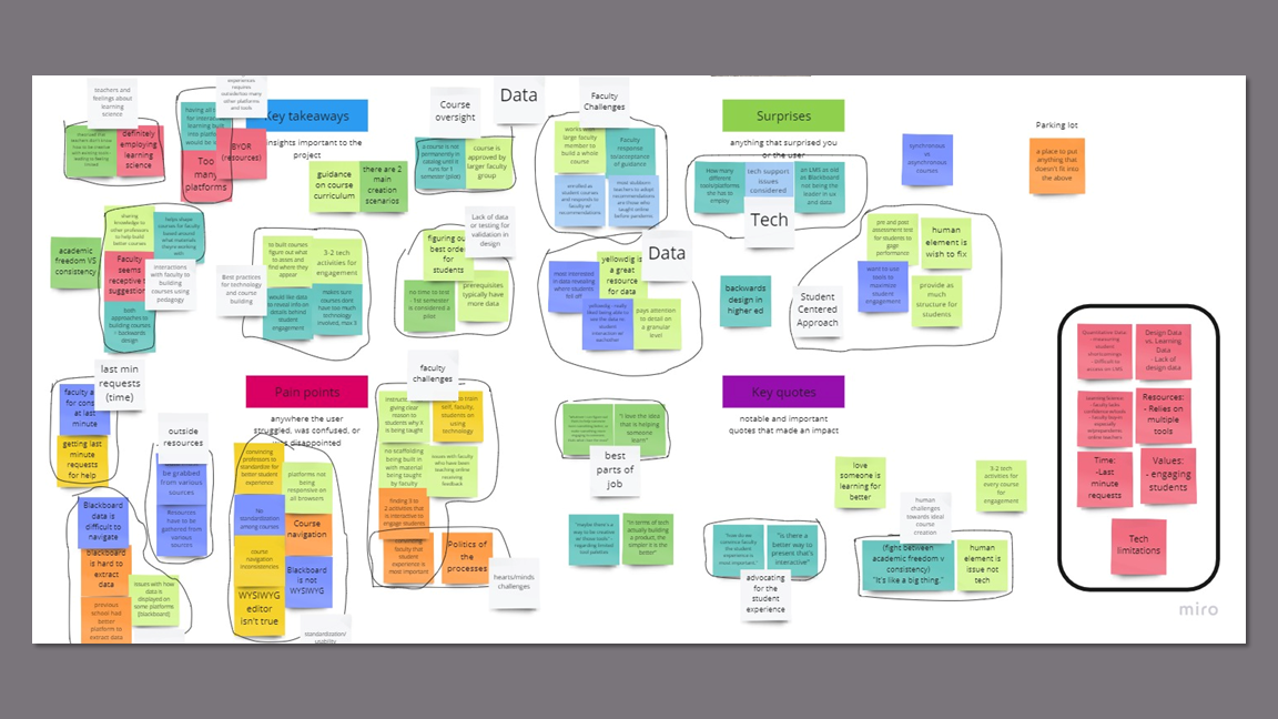
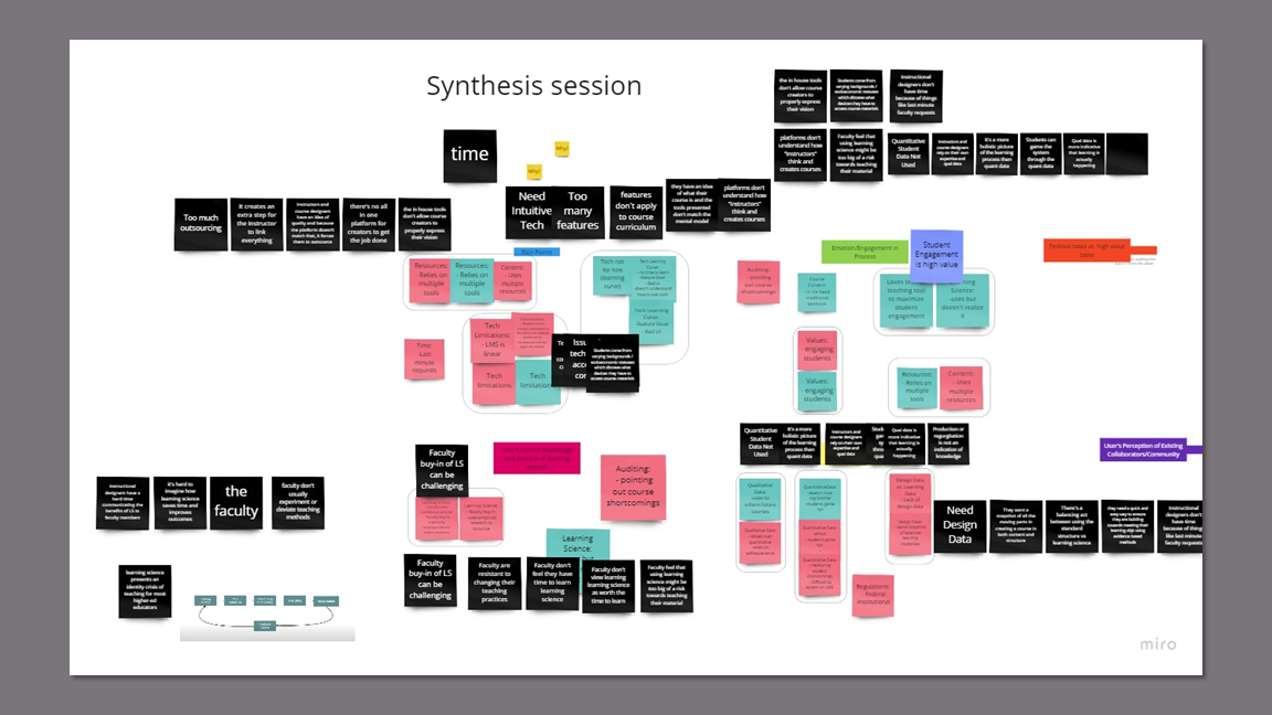
Key Insights
In-house tools don't allow course creators to properly express their vision.
Course creators are forced to add additional tech to the platform to support their ideal content which adds time, effort, and tech issue susceptibility to the course creation process.
Instructional designers want to create more interactive and enriching digital experiences that are not natively supported, like Voice Thread.
Students come from varying backgrounds and socioeconomic statuses which dictates what devices they have to access course materials.
Technological differences can cause content to be inaccessible.
Course creators must spend time troubleshooting tech issues and build in content redundancies.
Plug-ins may not be optimized for all possible runtime environments.
Course creators cannot easily test against all the variations in student hardware and software.
Instructional designers don't have a quick and easy way to ensure course structure aligns with pedagogy while working under tight deadlines.
Increased cognitive load trying to parse through course material and ensure it reflects good pedagogy structure.
Unbalanced courses affect student learning outcomes.
Instructional designers need to advise faculty with little notice.
Platforms don't understand how instructors think and create courses.
Most instructors learn how to use systems very slowly: they start with hosting files, then using the discussion forum, and then finally start building some pages.
Instructors are fearful of fully investing in the platform because they're unable to predict the consequences of choices made.
Language choices further alienate instructors from understanding what they can and can't do in a design environment.
Instructors feel that using learning science might jeopardize successfully teaching their material compared to their existing teaching methodologies.
Instructors resist restructuring their courses to incorporate learning science.
Students receive sub-optimal education experience.
Instructors miss out on the benefits of clearer grading criteria that would save time.
Incorporating module structures involves standardization which some faculty see as imposing on academic freedom.
Production or regurgitation of knowledge is not a true indication of learning.
Instructional designers and instructors use qualitative data to gauge student satisfaction.
Instructors distrust certain student analytics in existing LMs because they know the metrics can be gamed.
Instructors value engagement with students as the best way to teach and judge student learning outcomes.
Takeaways
The instructors’ distrust of their current platforms told us that we needed to carefully attend to language.
The instructional designers’ struggles to get instructors to incorporate learning science principles into their courses meant that we had to embed it into the platform to provide provide professional development without being obtrusive.
The concern for time and the participant’s lack of confidence in their technology skills kept us focused on keeping the experience simple and informative, while remaining familiar to the user.
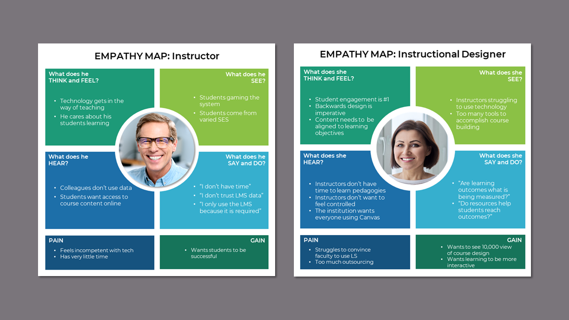
Two distinct personas emerged as instructional designers were experts in learning science and tech while instructors had little knowledge of learning science and low to moderate tech skills.
Personas
We created two personas to account for the differences between the instructors and instructional designers.
I generated empathy maps for each persona to further explore their divergences and convergences.
Empathy Map
User Journey Map - Current Case
Visualizing the processes with the user journey maps was integral to grasping the complexity and differences between the two personas.
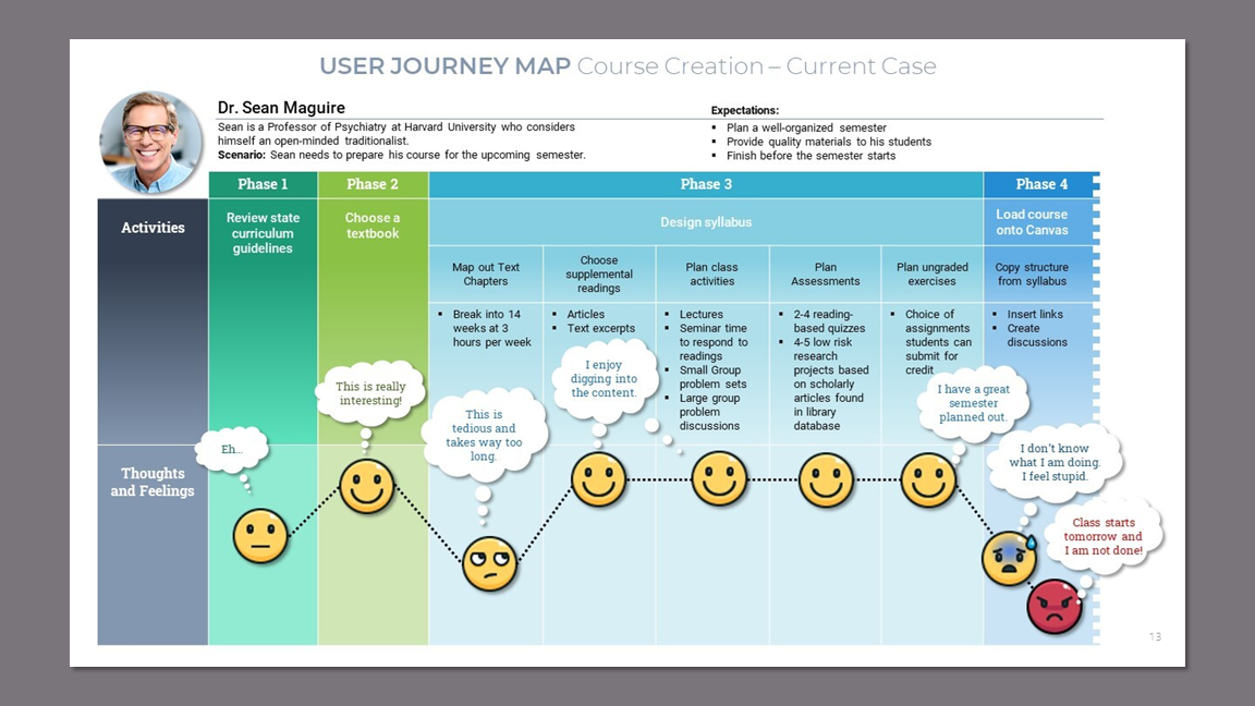
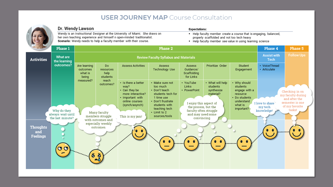
Takeaways
The user journey maps uncovered a disparity and complexity that could not be properly addressed in this short term project. This directed us to decide on one persona on which to focus.
Defining the Design Strategy
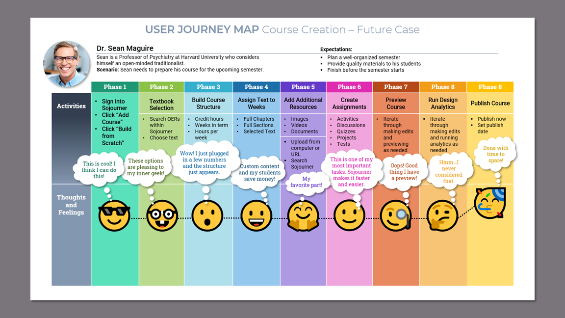
Honing in on the instructor persona allowed us to start exploring the solution so we could further narrow our scope to keep within the tight time constraints.
We focused on the instructor persona because our research showed that college professors need guidance in both learning science and technology.
I organized the activities from the current case journey map into multiple phases that could later be translated into information architecture.
User Journey Map - Future Case
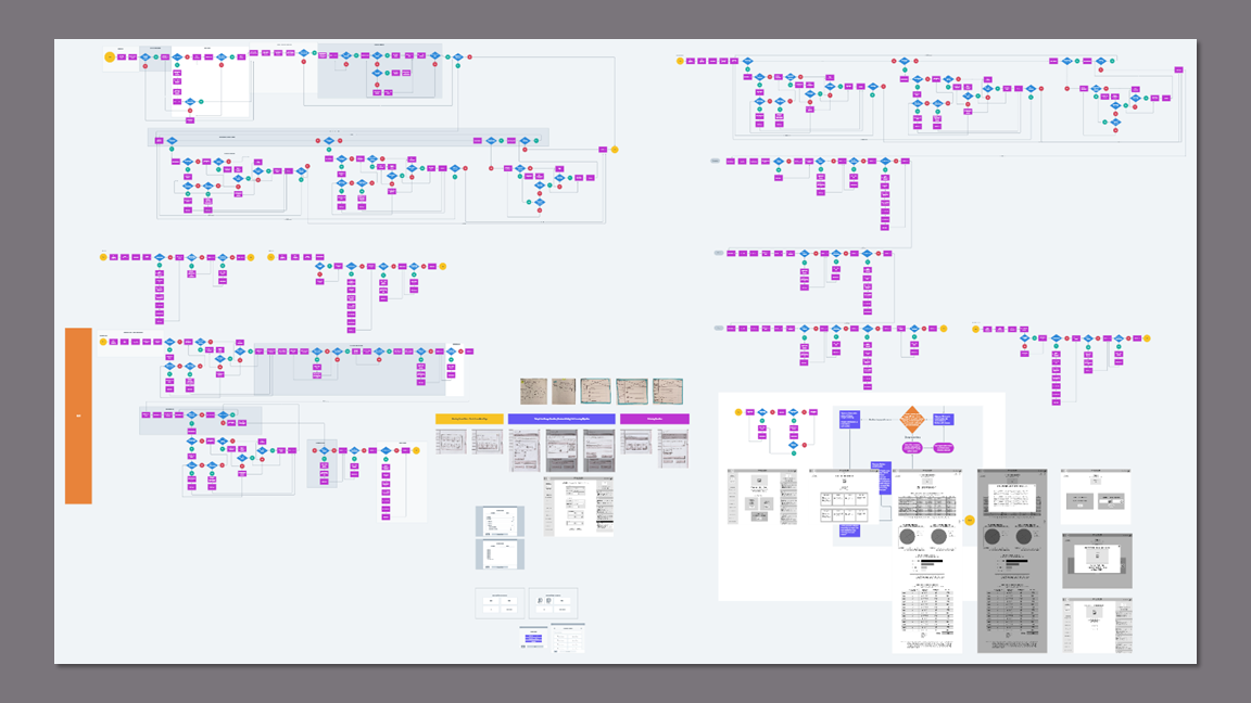
I created user flows for all phases of the future case user journey. This served as:
A reminder that we need to be mindful of scope creep.
A model to use for delegation of work.
A foundation on which to begin wireframing.
User Flows
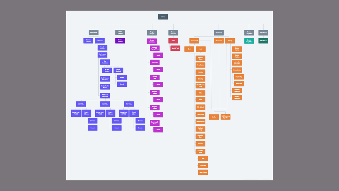
The site map I created was integral to building out the prototype especially since my teammates did not have any knowledge of courseware or common learning activities.
Site Map
Building out the entire platform would not be possible, so we decided to focus on two flows for testing purposes.
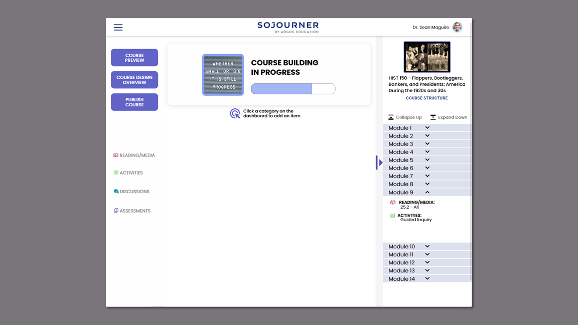
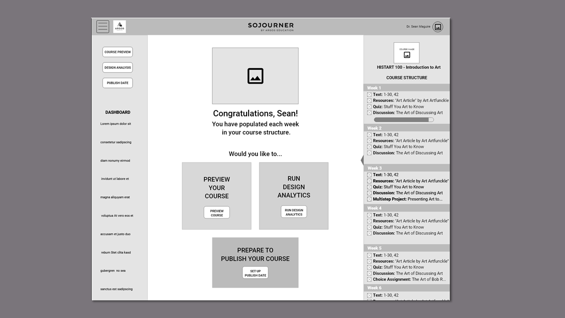
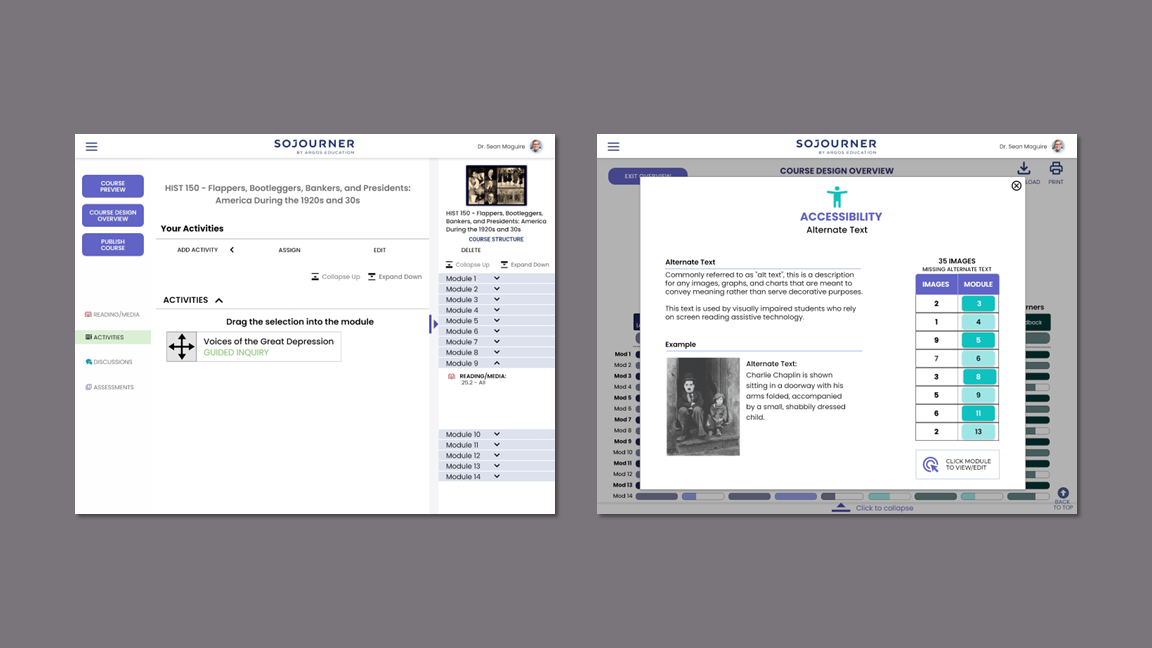
Creating the Course Set-Up flow would serve to educate our participants on the product so it would not be confused with a Learning Management System (LMS) that is not courseware, but a means to house files and student grades.
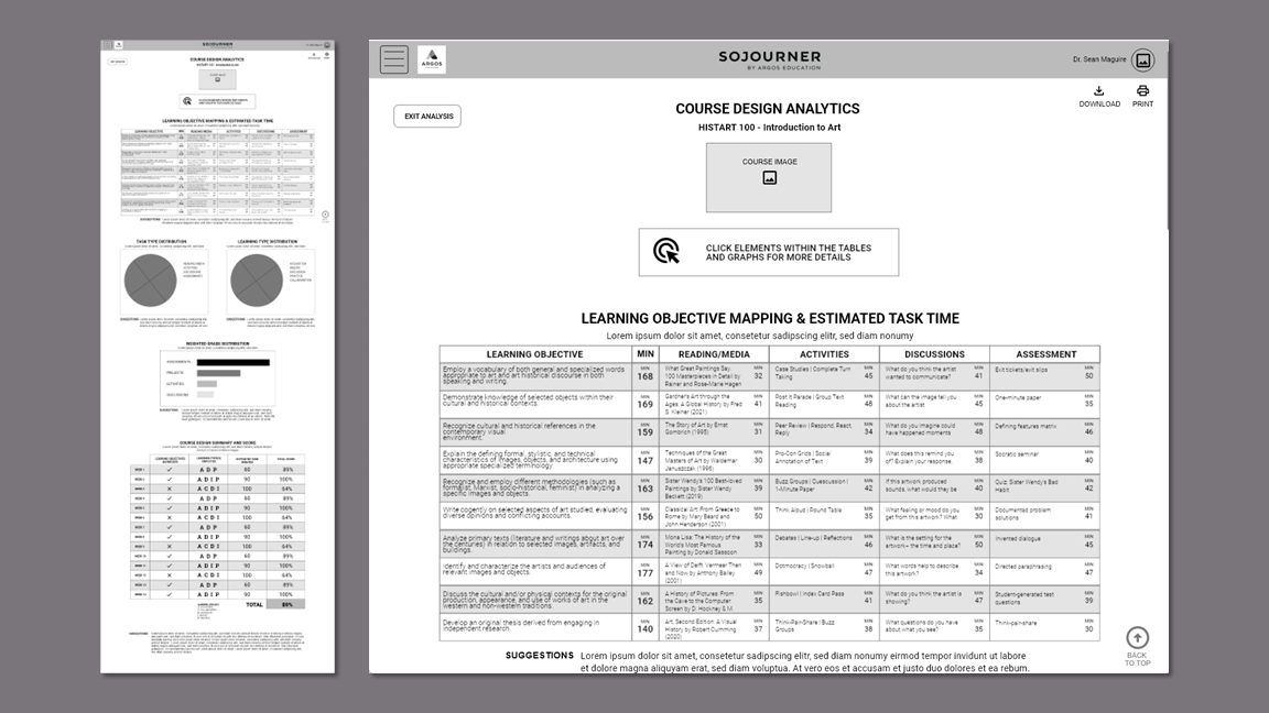
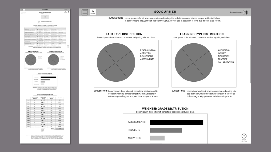
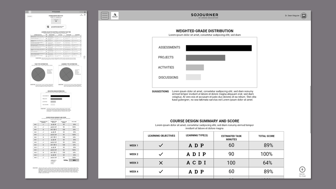
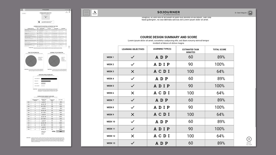
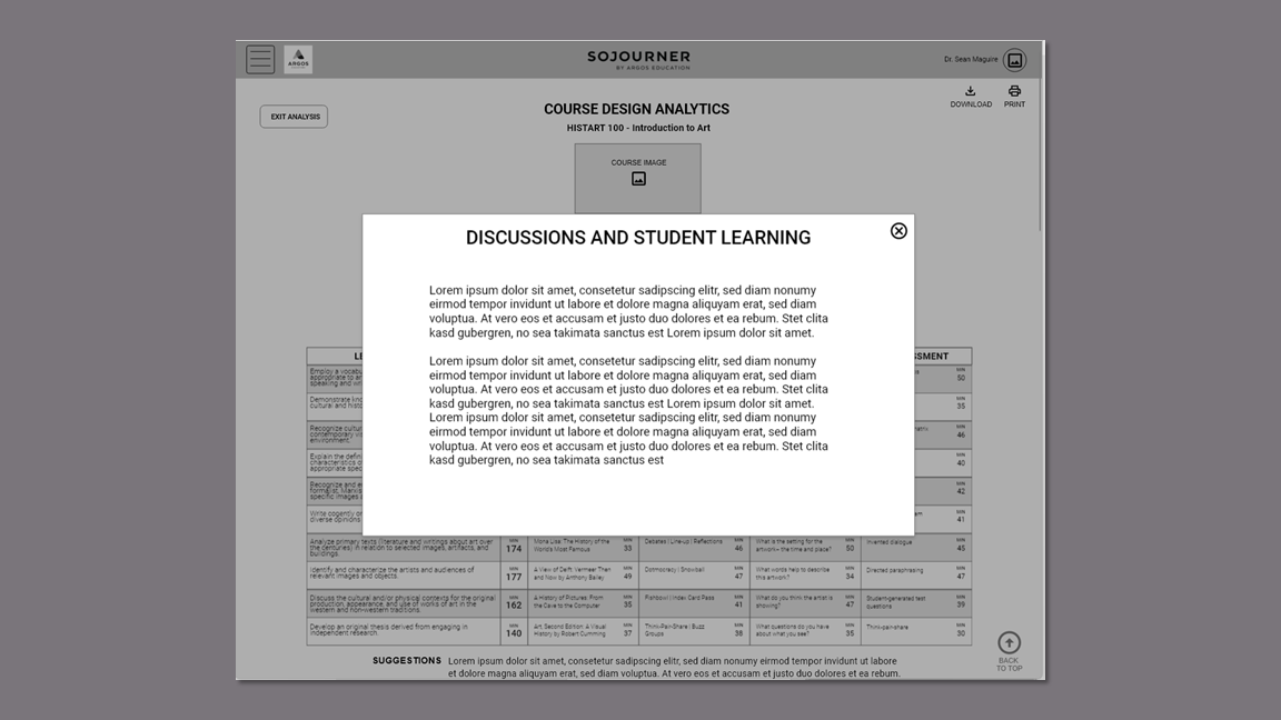
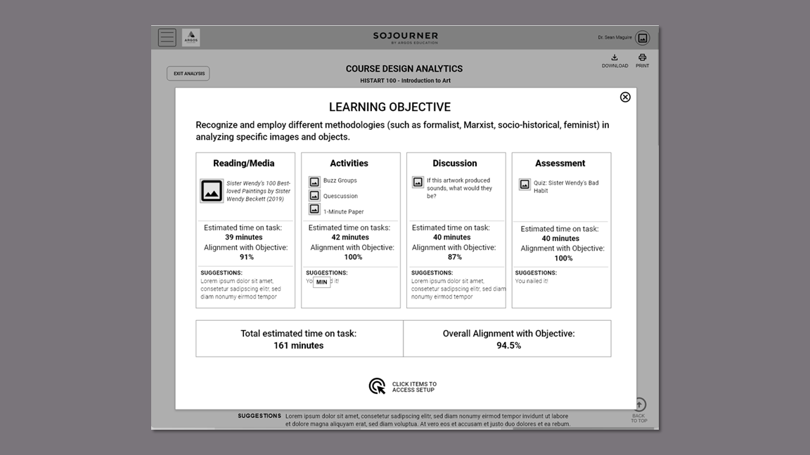
The Design Analytics flow would fulfill the client’s unique value proposition of providing learning opportunities for instructors while they build their courses.
Takeaways
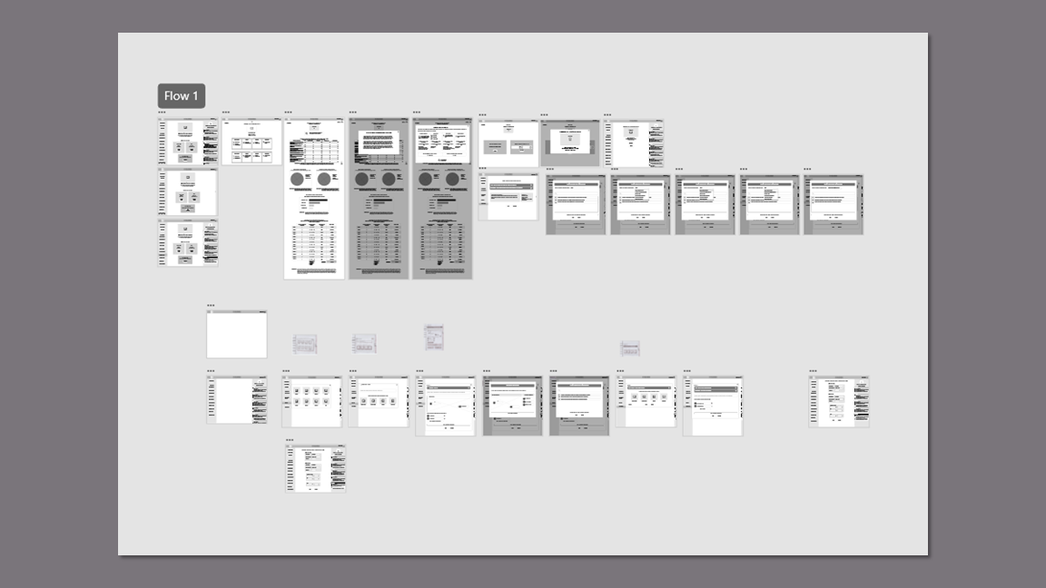
Wireframes
The team started with simple sketches, but the clock was ticking. Wireframing in XD helped me rapidly hash out some of my ideas for the design analytics. This was a complex undertaking and some context was necessary in order to fully flesh out the features. This gave us a concrete artifact to share with the clients to verify their vision.
Prototyping
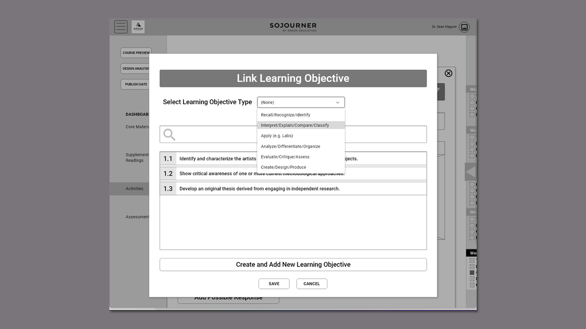
I created the clickable prototype for the Design Analytics flow that included linking a learning objective to a quiz and my teammate created the Course Design Set-up flow.
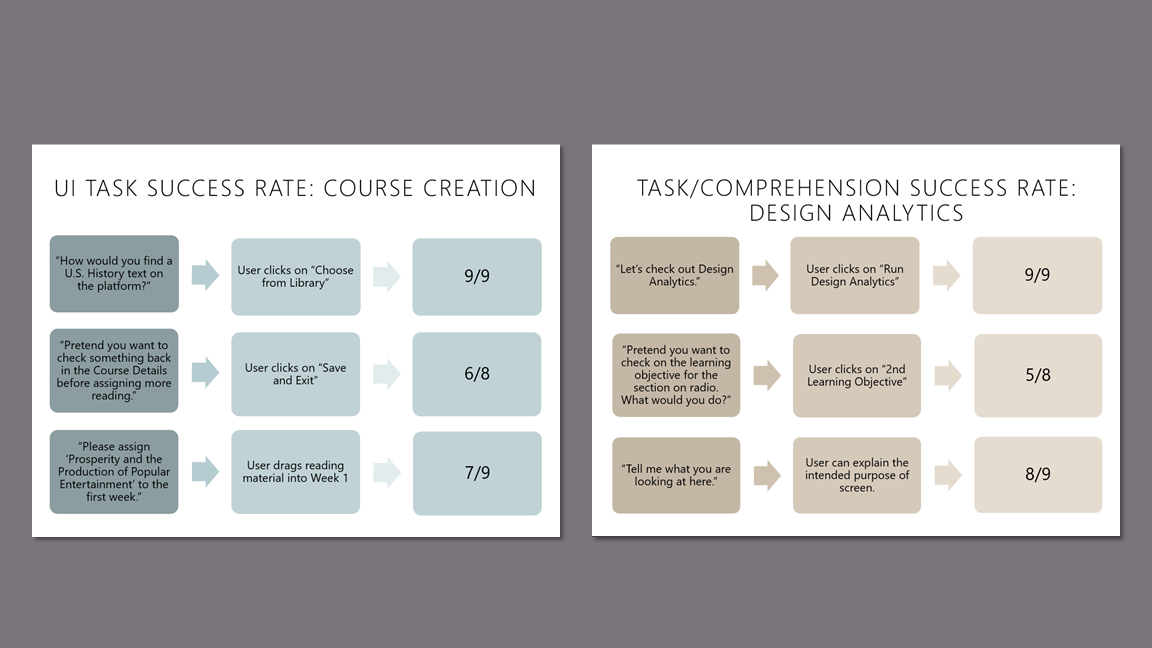
Usability Testing Findings
I wrote the moderator guide and conducted eight of the nine usability tests. During the 30 minute Zoom sessions, participants were asked to create a U.S. History course, view and interpret the design analytics, and link a learning objective to a quiz. They also answered 4 survey questions to validate the product concept.
The participants found the website easy to use and highly intuitive. They appreciated the structure, the collapsible sidebar feature, and the learning opportunities on the Design Analytics page,
"[The Design Analytics] really helps an instructor think through not just the pieces, but the alignment of these pieces as well."
"Accessibility data is helpful."
"I like this chart. It shows me what I need to work on most."
"I think that it was highly intuitive overall. I think that faculty members would like it a lot."
Accolades
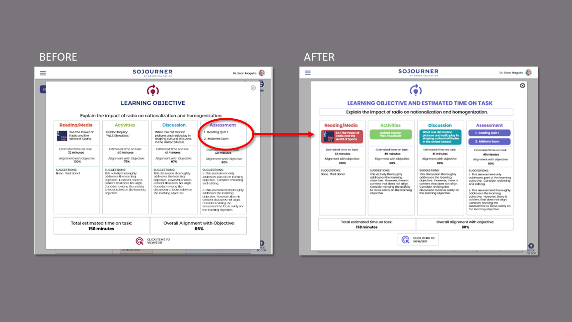
Participants had difficulty reading some of the text on the Course End Page and the Design Analytics Page.
Response:
Font size increased throughout prototype to be 16 point or greater.
Font size on Design Analytics page increased to 20 point.
Details on Learning Objective table are now accessible when the user hovers over the element.
Issue
Less tech-savvy users lacked confidence in which items were clickable, draggable, or could be scrolled.
Response:
Replaced clickable text with buttons.
Included directions for dragging.
Changed designs so scrolling is either obvious or unnecessary.
Issue
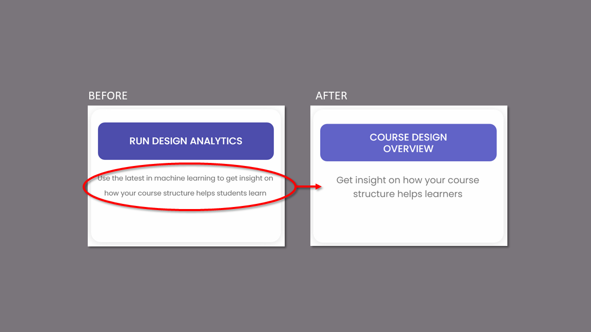
The participants who are strictly professors reacted negatively to the terms “Design Analytics” and “Machine Learning.”
Response:
Changed the name of the Analytics to “Course Design Overview.”
Removed “Machine Learning” terminology.
Changed description to appeal to instructors’ desire to help their learners.
Issue
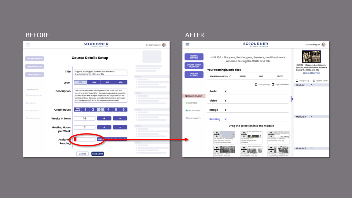
Most participants were confused by the placement of the “Assign Reading” portion of the module.
Several participants felt a negative reaction to the red color in the progress bar.
Response:
Created “Add Reading/Media” flow as part of main course building.
Removed the progress bar.
Issue
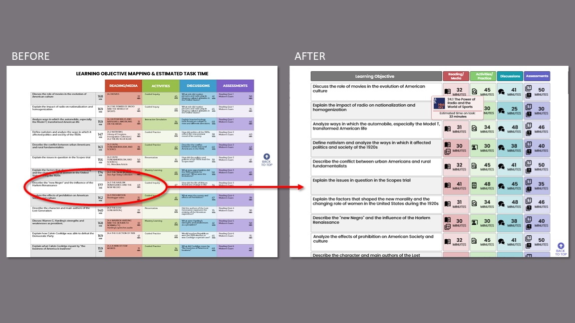
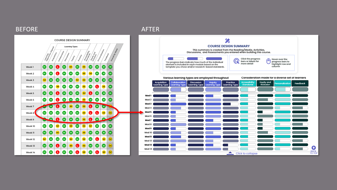
Participants stated that the summary table is overwhelming and were unclear on the “high/medium/low” designations in this and other data displays.
Response:
Redesigned summary with progress bars that show the element as compared to the course template and/or research-based standards.
Added color coding to separate like sets of data.
Collapsible table for easy reading.
Removed all “high/medium/low” designations.
Issue
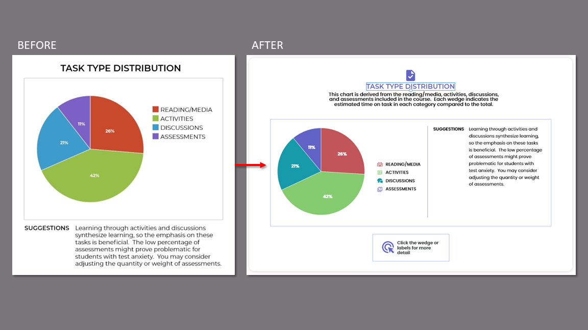
The instructor participants were unsure of how the data in the various displays were derived. This led to distrust of the data.
Response:
Included explanation of how data is derived with all data displays.
Issue
KPIs
Because we did not have access to the beta product and rigid time constraints, we were unable to establish baseline quantitative data. We did collect favorable qualitative data during testing and afterward with our short survey.
Task success metrics were used to confirm design choices and to inform needed changes for the final iteration.
Task Success
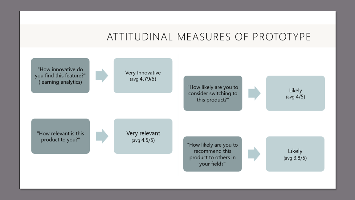
Given the unique value proposition of Argos, we felt it was important to get some attitudinal measures about how participants felt about specific features and the product as a whole.
Attitudinal Measures
Final Prototype
Course Design Overview (previously Design Analytics) flow.
Prototype Video