Improving the Animal Adoption Process by Making Applications More Accessible
Adoption Flow Redesign
Project Overview
WAG Animal Rescue is an all-volunteer rescue that fosters cats and dogs before placing them with their forever homes. Their website, which was created by an agency from a template, was only used as a means to collect online applications.
The Client
WAG used Petfinder’s website to showcase the animal photos and information. The usability issues of that site led to WAG personnel having to constantly field emails requesting an application. Users who did find the application link that directed them back to WAG’s site communicated submission issues and ended up answering the questions via email.
The Problem
I guided stakeholders through prioritizing goals as this will be a multiphase project to redesign the entire website and implement a digital marketing campaign.
I wrote the research plan and completed all phases of generative and evaluative research, including reporting, recommendations, and next steps.
I created hi-fi interactive prototypes for both mobile and desktop.
I built the new website using a builder platform, migrated the domain, and integrated SEOs.
My Role
Reduced time on task by 89% and error rate by 100% on adoption flow.
In first month after launch of new website, average engagement time increased by 43% and pageviews reached 210% of the previous month’s total.
Saved the company $2700 annually by researching and implementing new web hosting for their domain.
Outcome
Phase 1 started May 21, 2022 and the MVP was delivered on June 28, 2022. The new site launched on July 14, 2022.
Timeline
Discovery
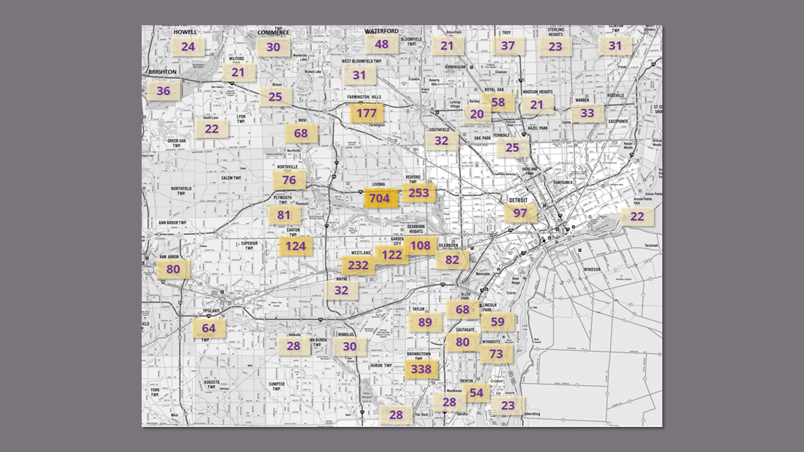
I did a deep dive into WAG’s existing data to guide the foundational research.
Creating a map of customers by city informed:
Which rescues to target for Competitive Analysis.
The demographics of users for Recruitment.
Customer Database Analysis
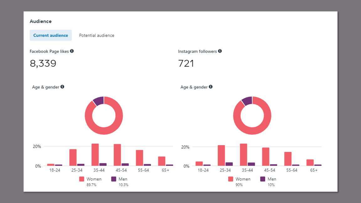
Most of WAG’s outreach is conducted through Facebook. Viewing the audience demographics contributed to Participant Recruitment and Persona Development by:
Validating the gender distribution I found in the customer database of 77% female to 21% male (2% couples).
Helping to determine the age range of 35 - 54.
Meta Audience Insights
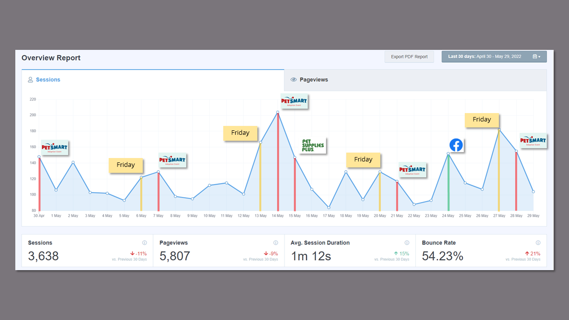
I investigated the peaks on the sessions report and added in labels to make sense of the site usage. The results showed that traffic surges were based around their weekly adoption events. This, in addition to session duration of 1 minute 12 seconds, confirmed that the site was only being used for completing applications.
This affirmed the focus of my research on the adoption flow
Website Analytics
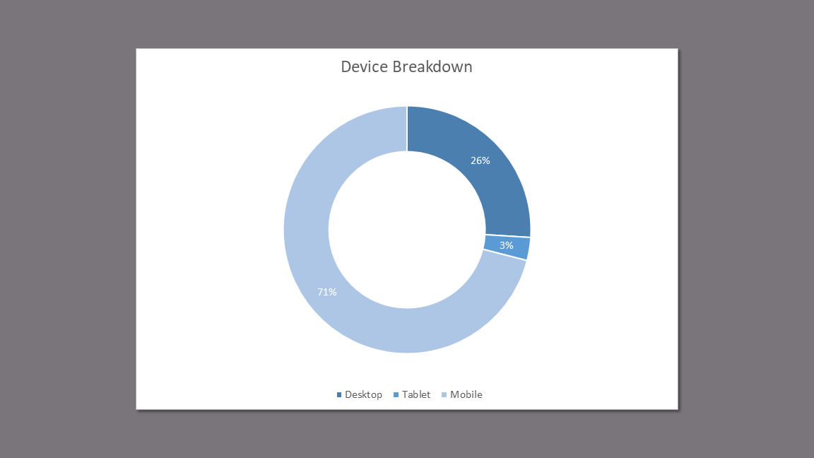
The device breakdown of 71% mobile to 26% desktop made it clear that:
Usability Testing needs to be performed on both devices.
My designs need to be mobile-first.
Device Breakdown
Takeaways
The user participants (and later, the persona) would need to be women between the ages of 35 and 54.
The participants and competitors should be located in Livonia, Michigan and/or the surrounding areas.
Responsive design with a heavy focus on mobile needs to be a consideration in both testing and ideation.
Competitive/ Comparative Analysis
I completed a features and heuristics analysis on six animal rescues chosen from areas uncovered on my user map as having high concentrations of WAG customers.
Understand the standard structure and features of rescue websites.
Learn about features that work and do not work in order to inform design.
Research Goals
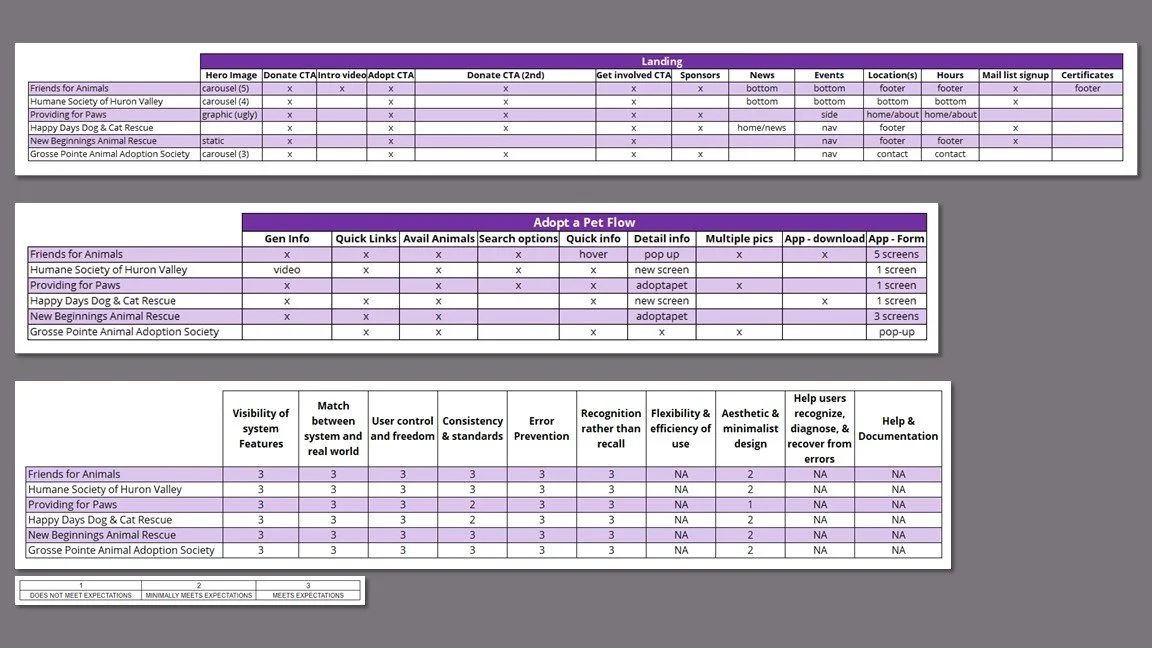
Findings
Adopt and donate CTA buttons are prominent with donate repeated multiple times on landing page.
Most sites have the adoptable pets directly on their website.
Events are prominent and up-to-date.
Most sites have a “subscribe to email” sign-up.
Most sites appear to have used a template.
Takeaways
The prevalence of the pets embedded in the rescue’s sites led me to ask my participants about their preference during the interviews.
I referenced this finding in addition to the prominent and repeated CTAs during the ideation process.
User Research & Usability Testing
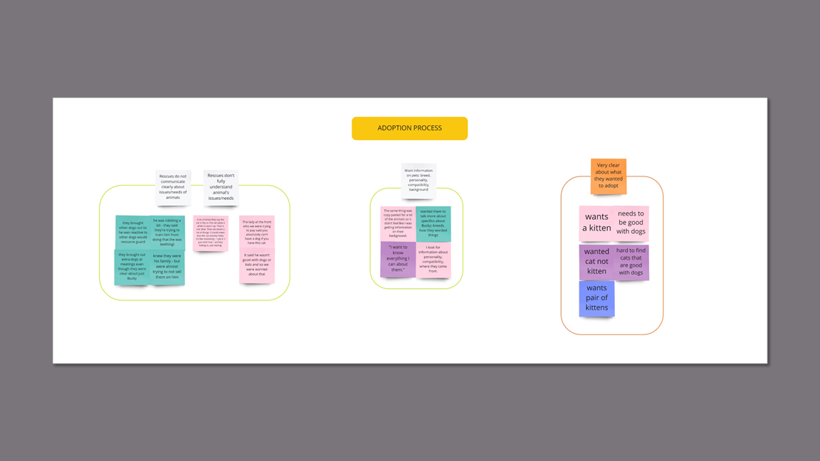
I conducted 40 minute interviews with five female recent pet adopters between the ages of 34 and 51 via Zoom. The same users participated in 20 minute usability tests on WAG’s current adoption flow. Since 79% of WAG’s adoptions are cats/kittens, they were asked to choose a cat and then find the adoption application.
User Interview
Understand the user’s experience with their rescue/shelter.
Gauge user satisfaction with the application and adoption process.
Discover any pain points in the adoption process.
Usability Test
Uncover any pain points, blockers or errors in accessing the cat application on the current website.
Take note of features and interactions that are working.
Research Goals
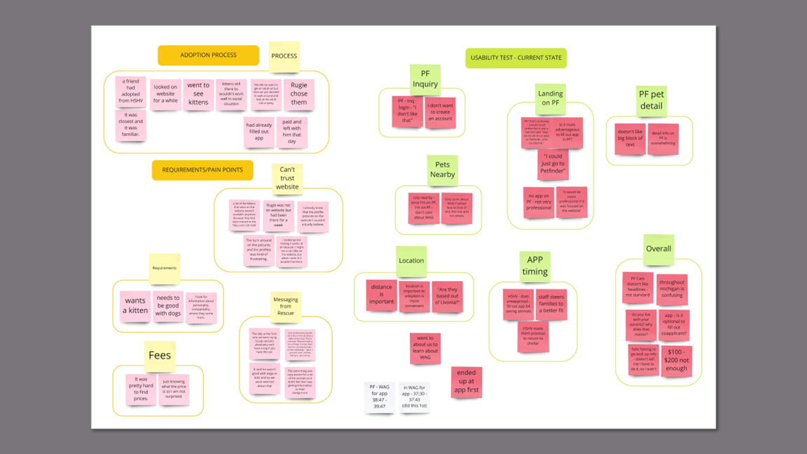
Key Insights
Using Petfinder to show the adoptable pets causes confusion and frustration with users who wish to support WAG.
Users are caught off guard when they click on “adoptable pets” and land on another site.
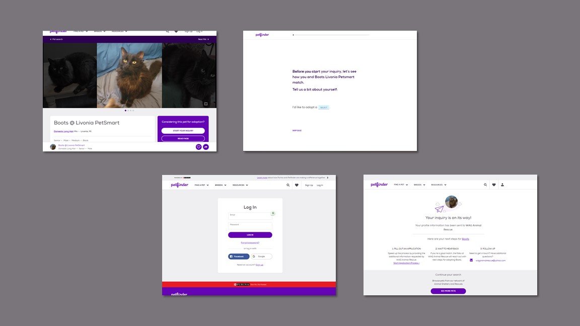
Completing the inquiry is off-putting because Petfinder asks irrelevant questions and requires a login.
Inquiry does not lead to the application. Finding an application is overly complex.
Users are frustrated by vague, incomplete, and incorrect information on a pet’s needs and characteristics.ds or issues.
Rescues label animals as “shy,” “not good with dogs or kids,” “resource guarding” without context.
Pet descriptions are “copy-pasted” and not specific to the animal.
Users want to know personality, compatibility, breed, origin.
Location is important to users.
Some users will not consider a pet if the drive is overly long.
Users were confused about the location of WAG and the pets.
Takeaways
The disparate Key Insights showed the need to scope the project to just the adoption flow and address the others in separate studies.
The user interview data helped solidify the user persona and the details of the empathy map.
The usability testing data shed light on Petfinder as the main problem with the user journey through the adoption process.
Persona
I developed a middle-aged female persona to represent WAG’s customer data and reflect the emotions and experience of my research participants.
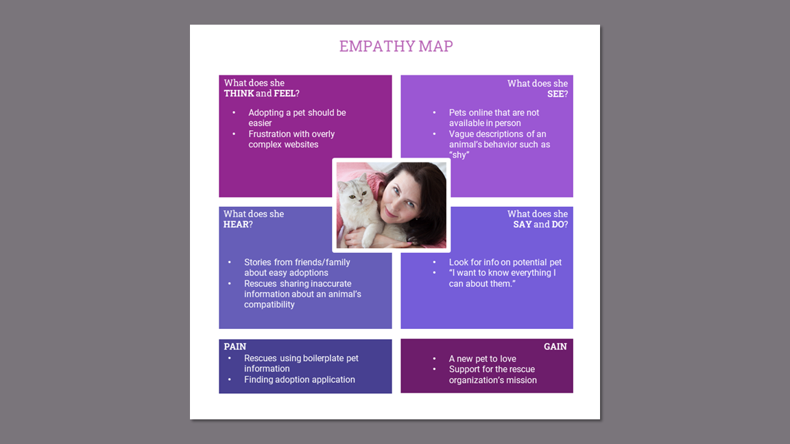
I created an empathy map to understand the user and serve as a touchstone during design. This will also be used to inform future studies for WAG.
Empathy Map
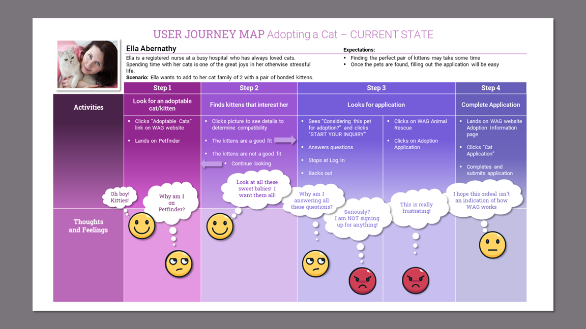
User Journey Map - Current State
Creating the user journey map made visual what works in the adoption process and highlighted the pain points.
Takeaways
Viewing the user frustration concentrated on Step 3 in which the user is searching for an adoption application led me to further explore the process by creating a user flow to corroborate or disprove my assumption that Petfinder was the problem.
Defining the Design Strategy
Mapping out the current state adoption user flow helped illustrate the unnecessary complexity of the process and gave me a starting point for solving the problem.
I watched the recordings of the usability tests to gather every minute detail of the user’s experience on the current site.
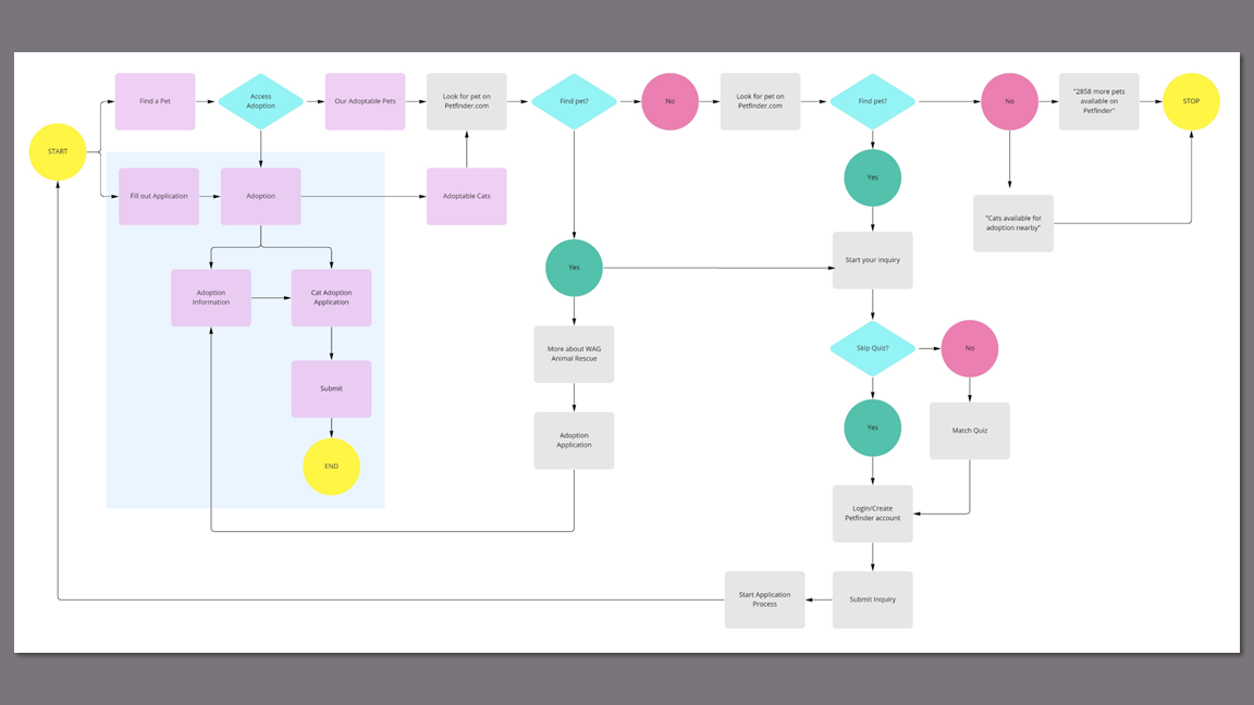
Website - Current State
The completed user flow:
Confirmed my assumption that Petfinder was the problem.
Encouraged me to create a future state user flow to begin problem solving.
User Flow - Current State
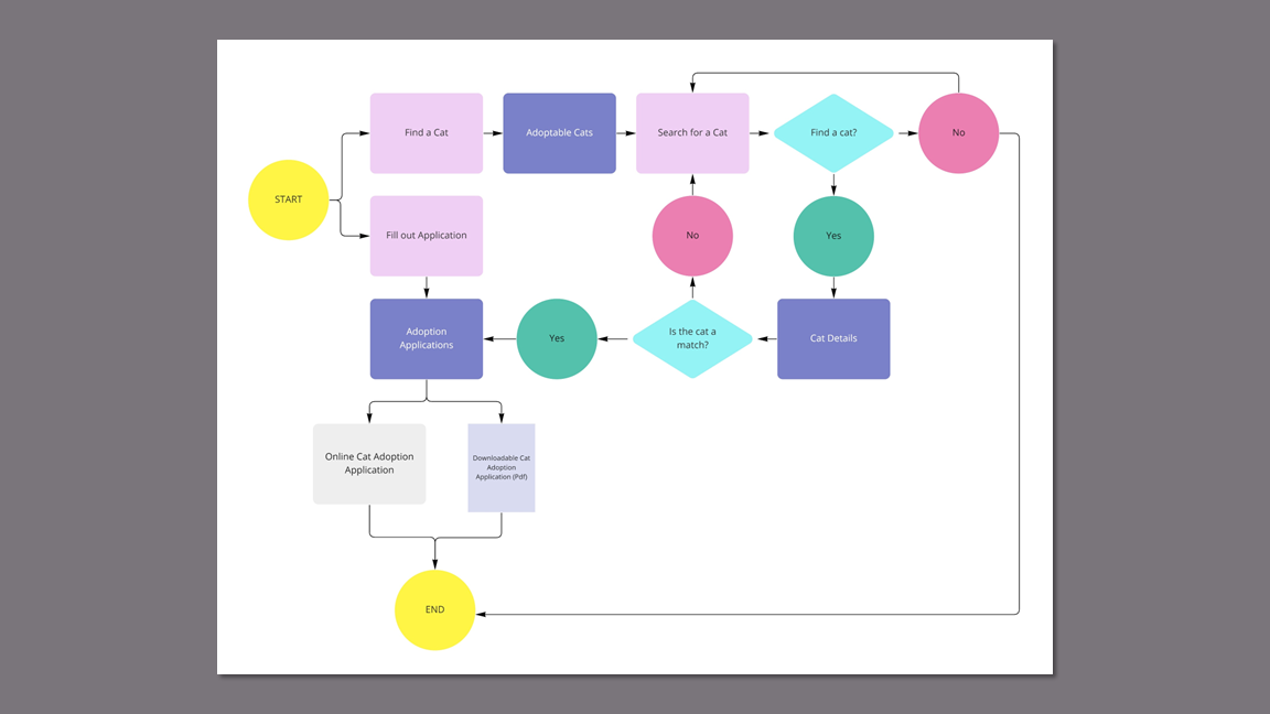
Since Petfinder was identified as the problem, taking it out of the flow was the solution. I referred back to my competitor data and decided that the animals should be embedded on WAG’s website.
User Flow - Future State
I normally create a future state journey map prior to creating a “happy path” user flow. For this project, I dove into the current state user flow first, pulled out the essential actions to create the future state flow, and then created the journey map. This humanized the process and put user empathy back at the forefront of the design process.
User Journey Map - Future State
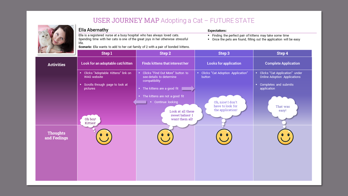
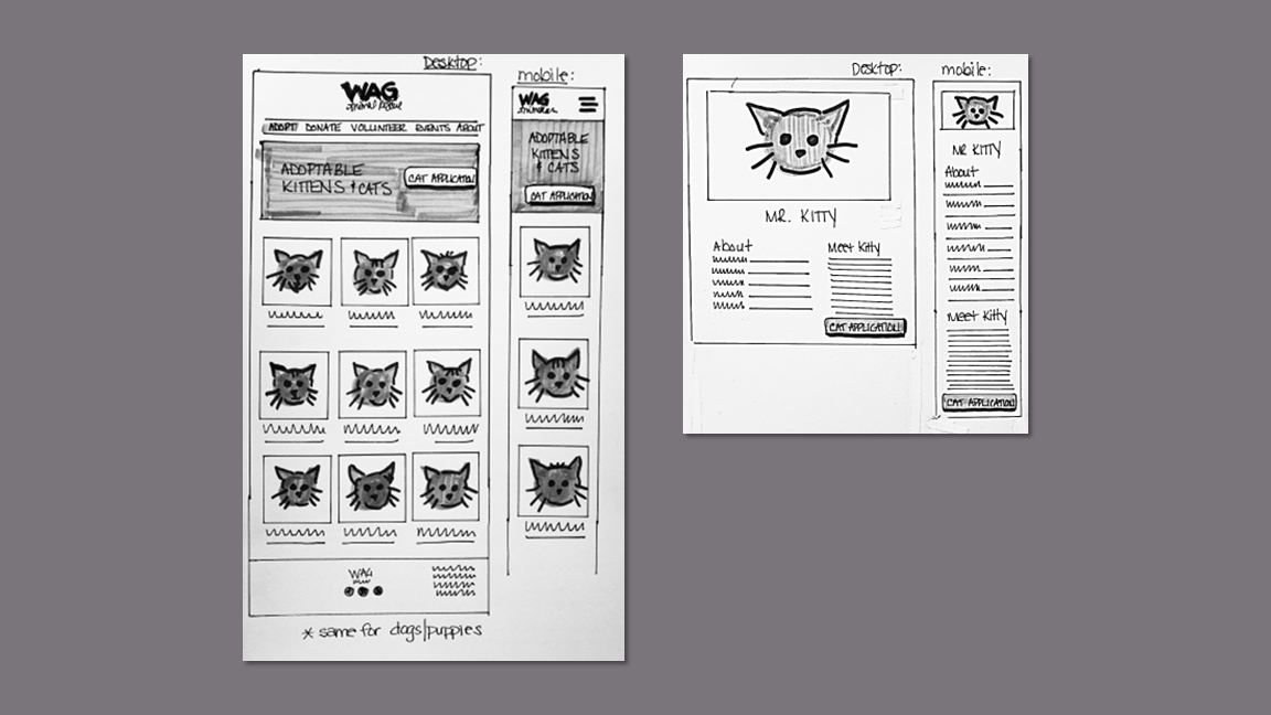
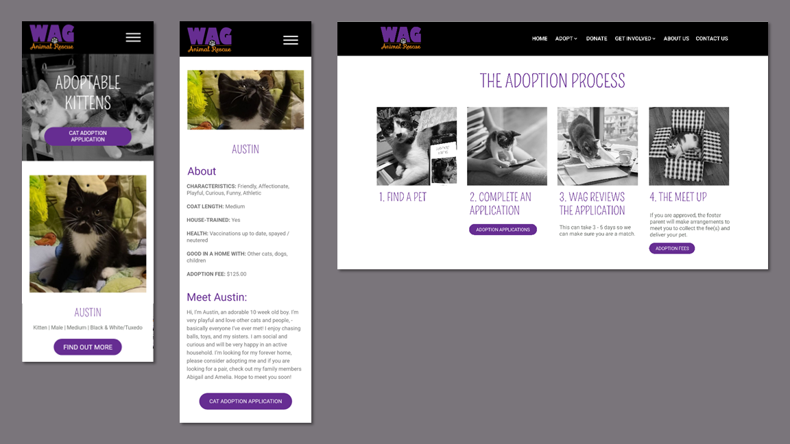
Building screens for the adoptable animals would be essential to a solution that involved removing Petfinder from the flow.
The adoption application needs to be easy to find and one click away from each pet profile.
Takeaways
Wireframes
I started sketching with marker on paper and tested out some mid-fi prototypes in Adobe XD to test the concepts.
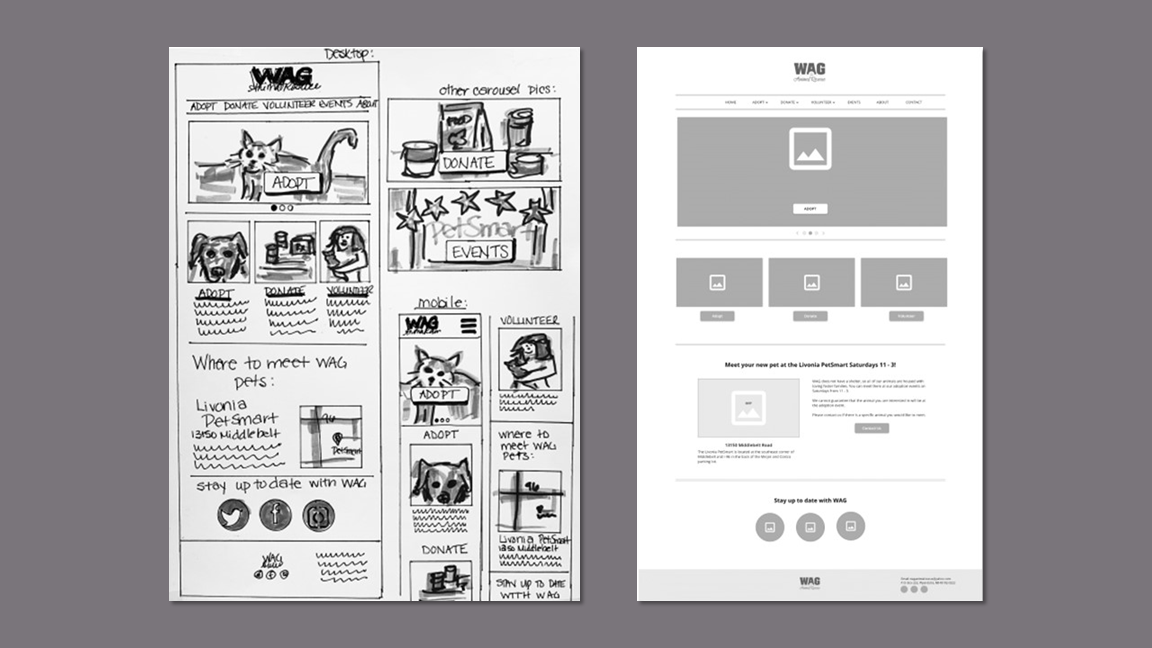
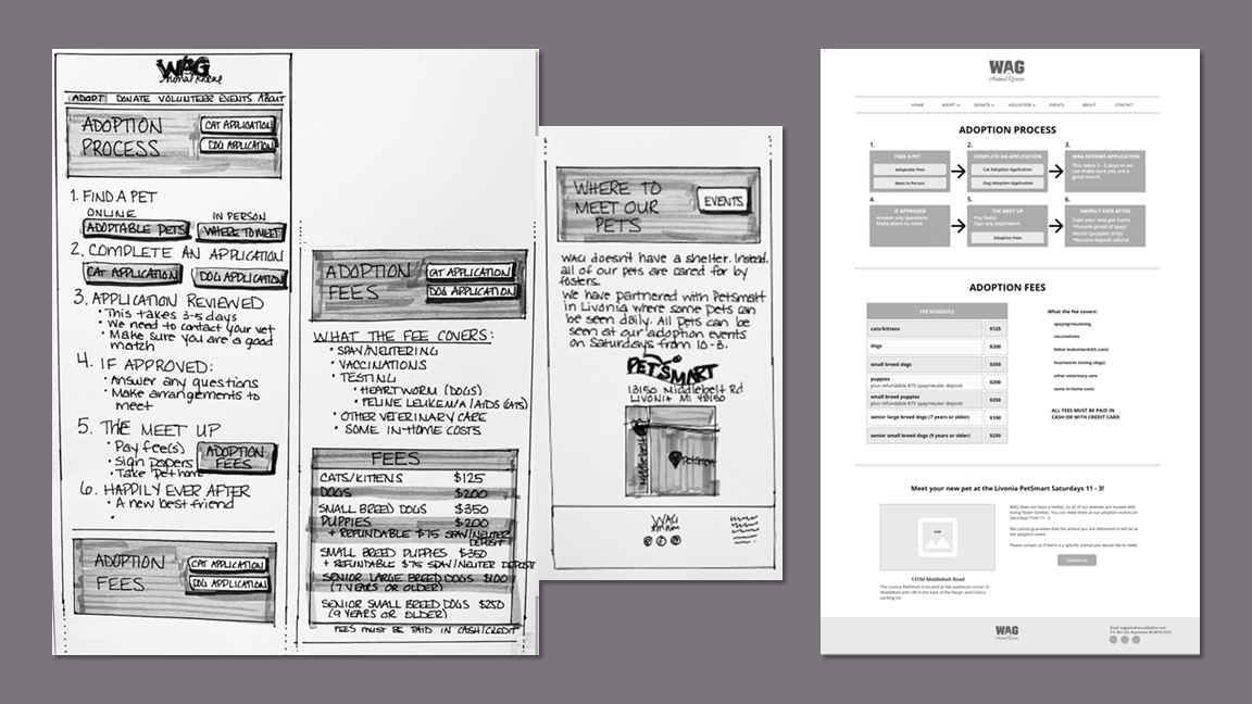
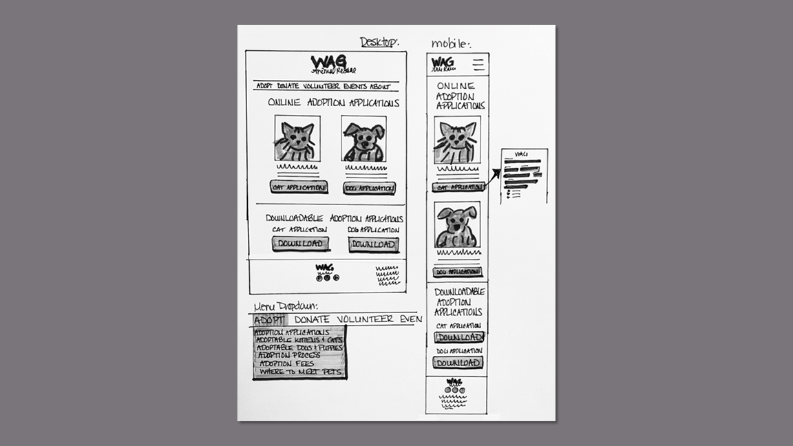
Prototyping
I created both mobile and desktop clickable prototypes in Adobe XD based on the adoption user flow. This matches the device experience and elements accessed in the first round of usability testing.
Usability Testing Findings
I invited the same five participants from the first round to test the prototype via Zoom. In the 20 minute session, they were asked to perform the same task as previously: choose a cat and then find the adoption application.
The participants found the website much easier to use and appreciated the various places to access the cat adoption applications.
“This is the most user-friendly website I have experienced for cat adoption."
“The application is right there. I'm looking at my kitty that I was interested in and it’s right there. I can even download it if I wanted.”
“Way quicker and easier than before.”
Accolades
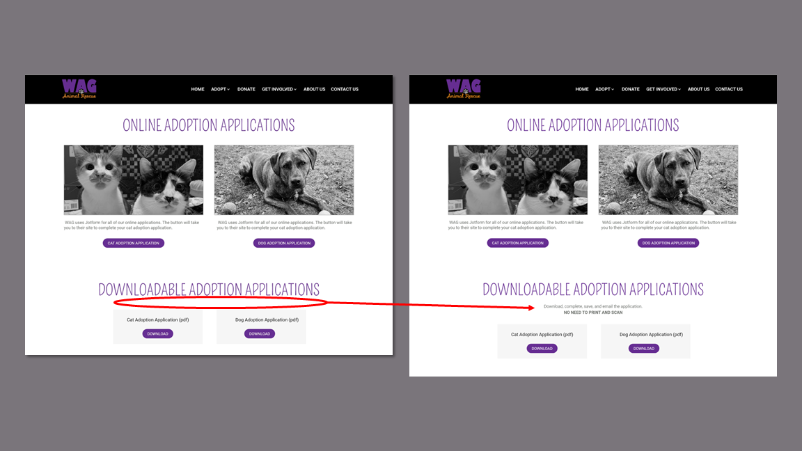
Participants expressed concern about the hassle of having to print, complete, and scan a PDF application.
Response:
I included directions on how to use the fillable PDF with emphasis on not needing to print and scan.
Issues
KPIs
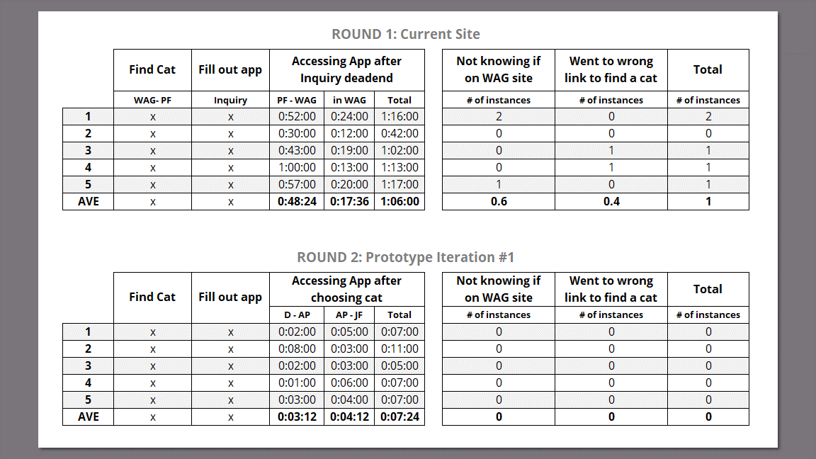
I recorded baseline time on task and error rate data for the first round of usability testing on the current site and compared them to the results of the testing on the prototype. I also compared the satisfaction ratings with accessing the adoption application for each round of testing.
On the current site, WAG’s customers were at the mercy of Petfinders’ platform. The first and most prominent CTA leads the user through 10 questions, requires a login, and then sends the rescue an email. At no point is the user provided with an application to complete.
At that point, the user must return to the animal details screen and search for an application.
To create a more lateral comparison between the current site and prototype, I recorded time on task from this point after they had reached a dead end.
Metrics Rationale
Time on Task
The average time to access the cat adoption application on the current site was 1 minute 6 seconds. On the prototype the average time was 7.4 seconds, a reduction of 89%.
Error Rate
Four out of five participants made at least one error during the first round of tests, but no participants made errors with the prototype.
Time on Task & Error Rate
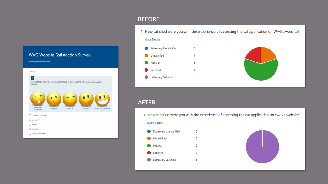
The average response to the question of satisfaction with accessing the cat application increased from “Neutral” on the original site to “Extremely Satisfied” with the prototype.
User Satisfaction
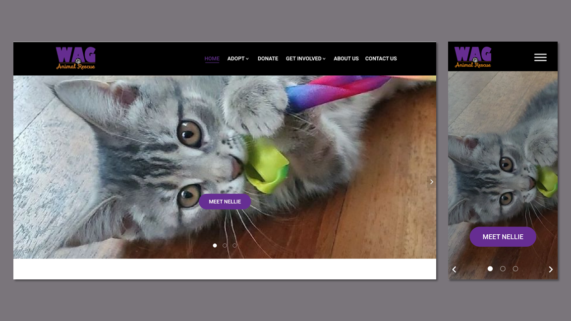
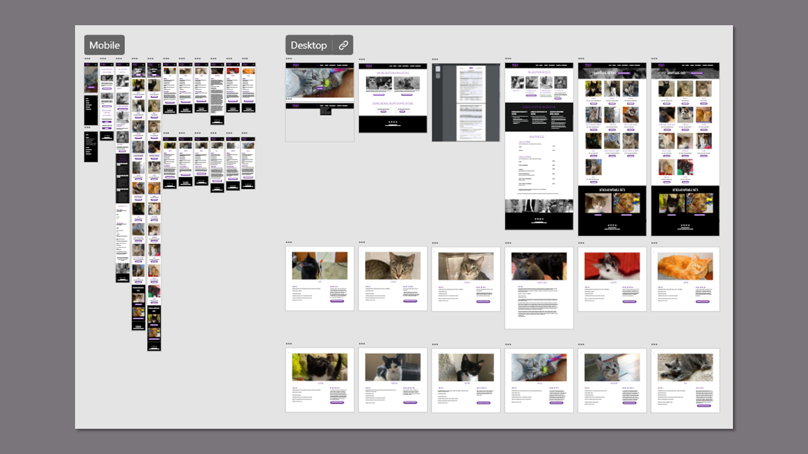
Final Prototype
Desktop
Mobile
Prototype Video