Making Commutes More Pleasant by Improving Usability
Vehicle Multimedia Display Redesign
Project Overview
I pursued this project on my own after drinks with girlfriends who expressed their frustrations with using the multimedia displays with their iPhones in their Chevy Blazers.
The Client
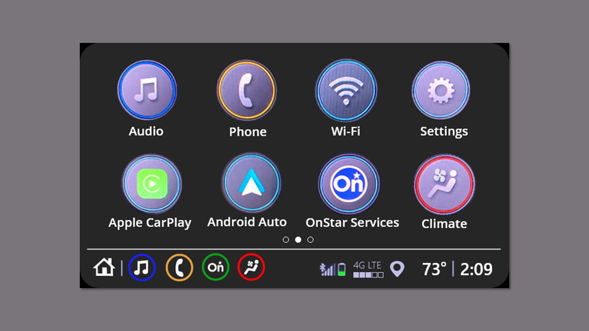
The multimedia display in recent models of the Chevy Blazer has limited access to some system features when Apple CarPlay is in use.
The Problem
I wrote the research plan and completed all phases of generative and evaluative research.
I created hi-fi interactive prototypes.
My Role
Timeline
This project spanned approximately 3 weeks in October 2021.
Competitive/ Comparative Analysis
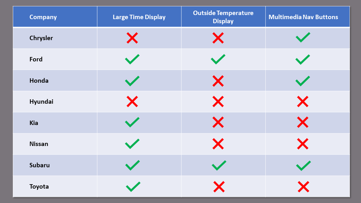
I searched images of the multimedia displays of the major automakers to see if they had a large time display, outside temperature display, and navigation buttons for the display from within CarPlay.
Determine the similarities and differences among how the automakers multimedia displays work with Apple CarPlay.
See if there is a solution a competitor is currently employing.
Research Goals
Findings
I found that 6 of the 8 competitors lacked at least one of the features I was reviewing.
One had none of the features.
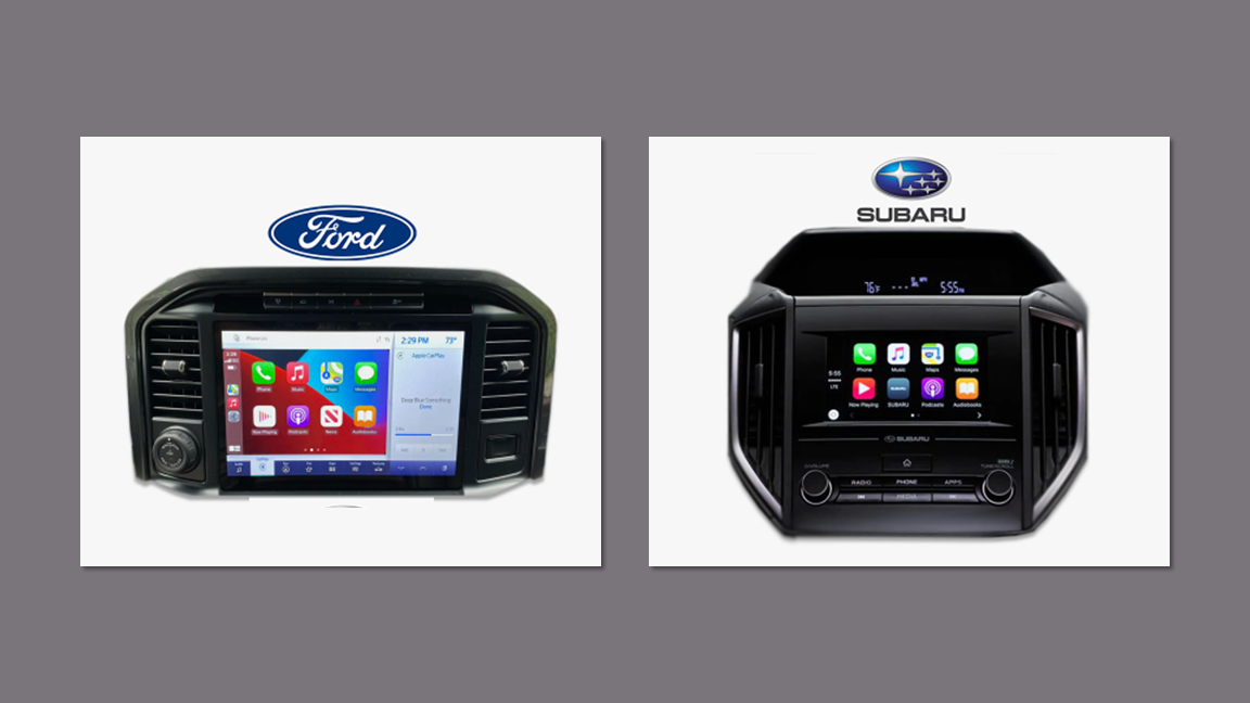
Two of the competitors, Ford and Subaru, had all three features.
Takeaways
Ford’s solution provided dual controls between the CarPlay app and the internal system, but it sacrificed a quarter of the screen space. This made it clear that I must try to design a solution that preserves as much of the display as possible.
User Research
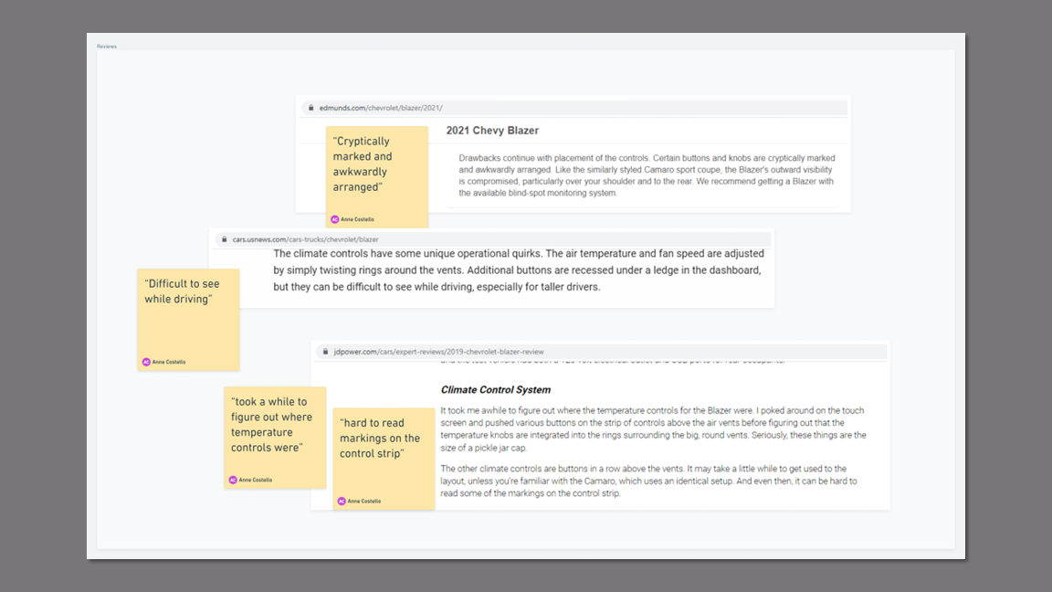
I conducted 30 minute phone interviews with five professionals who drive recent model Chevy Blazers, use the CarPlay app, and commute 20 - 45 minutes one way. In addition, I read several reviews of the Chevy Blazer to corroborate some of my findings.
Understand how the participants use their multimedia display with and without CarPlay.
Uncover any pain points.
Discover any desired features.
Research Goals
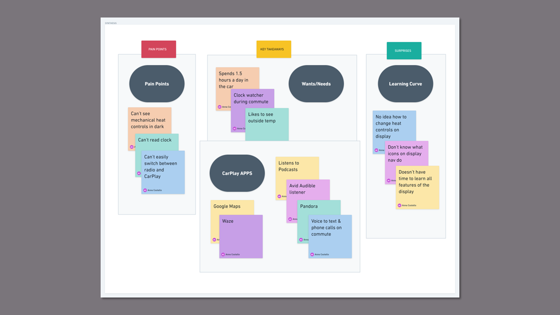
Key Insights
Participants have difficulty reading the clock while in CarPlay because the font is too small.
This causes anxiety, as they all admitted to clock watching on the way to work.
Checking their phones or watches for the time means taking their eyes off the road in heavy stop-and-go traffic.
All participants stated that they depend on their iPhone apps on a daily basis for navigation, communication, information, and entertainment while driving.
Navigating rush hour traffic in Metro Detroit where construction season is 9 months a year requires a navigation app like Waze or Google Maps.
All participants stated they use the voice option to text or make calls during their commutes.
Broadcast radio, the outside temperature, and digital climate control, all valued by users, are not accessible from within Apple CarPlay.
Users have to exit the CarPlay app to access the vehicles system features which interrupts their navigation and causes them to take their eyes off the road.
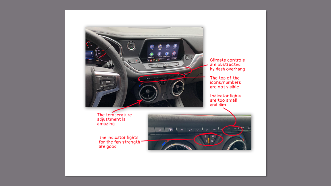
The participants who are currently driving late model Blazers all complained about how difficult it is to see the climate control buttons in the dark and their inability to make adjustments while using CarPlay.
The mechanical climate control buttons are obstructed by the dash overhang so reading the symbols on them is nearly impossible.
In the dark, the indicator lights are too small and dim to be visible and provide system status.
Takeaways
The best solution integrates the system features with the CarPlay app so both would be accessible at all times.
Improving the usability of the digital climate controls is necessary to work around the problematic mechanical controls.
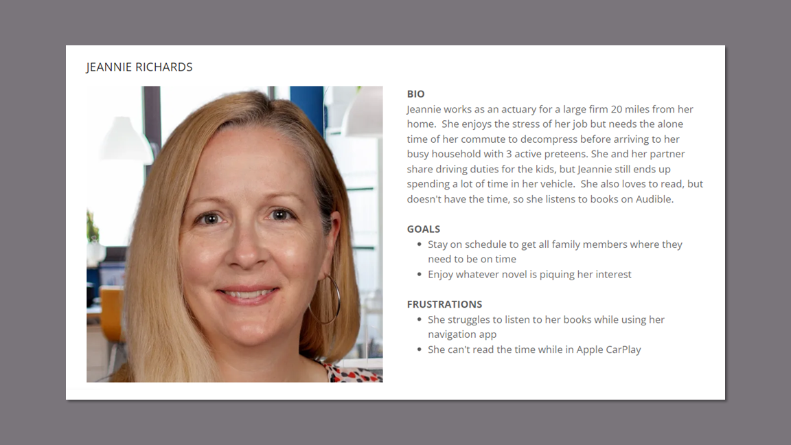
Persona
I developed a persona that is representative of the demographics of American SUV drivers and reflects the emotions and experience of my research participants.
According to JD Powers, the average age of a midsize SUV owner is 49, with almost half of them being women.
Persona
User Journey Map - Current Case
Creating the user journey map made visual the pain points with the multimedia display in the user’s commute.
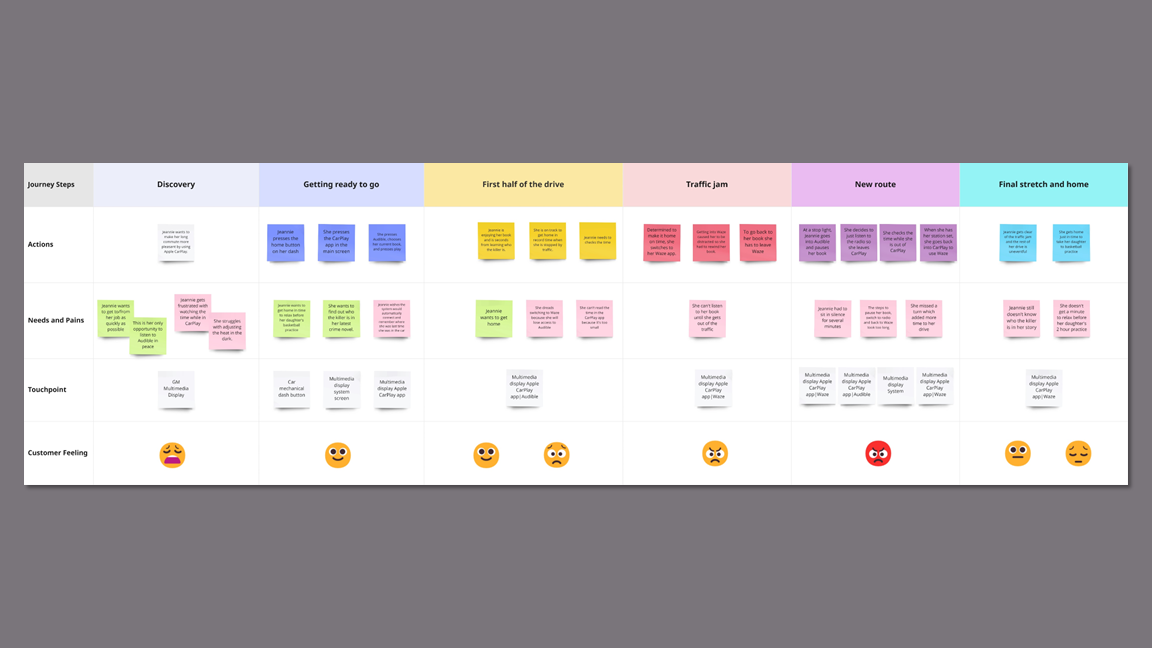
Takeaways
Following the user journey map allowed me to experience the many touchpoints and frustrations the user experiences on the commute home. This highlighted the necessity of placing in-system and CarPlay controls on one screen.
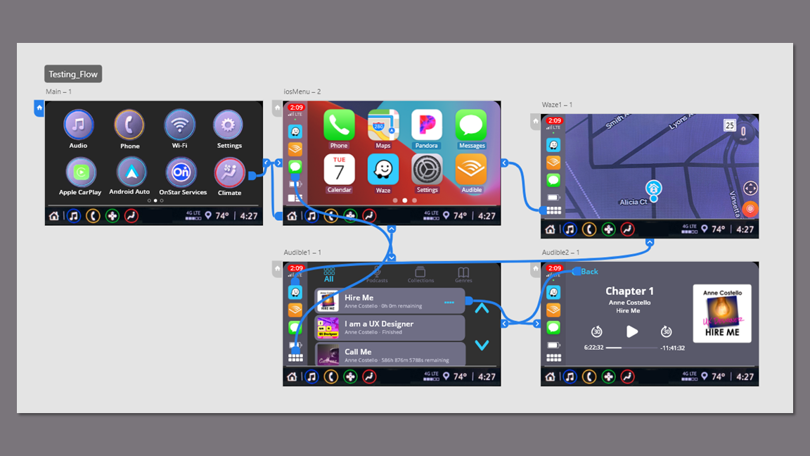
Wireframes
I started sketching with marker on paper and tested out some mid-fi prototypes in Adobe XD to test the concepts. Matching the mid-fis to the existing multimedia display, provided a foundation for building the hi-fi prototype.
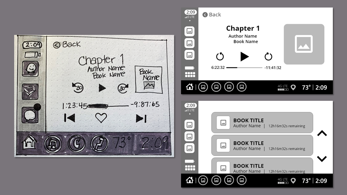
Prototyping
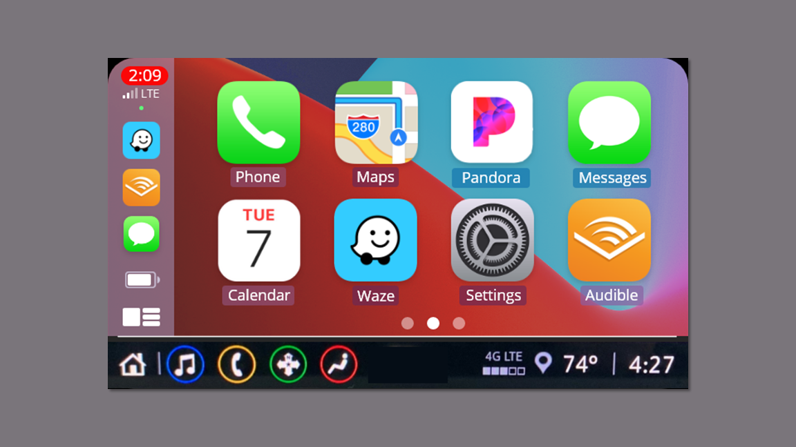
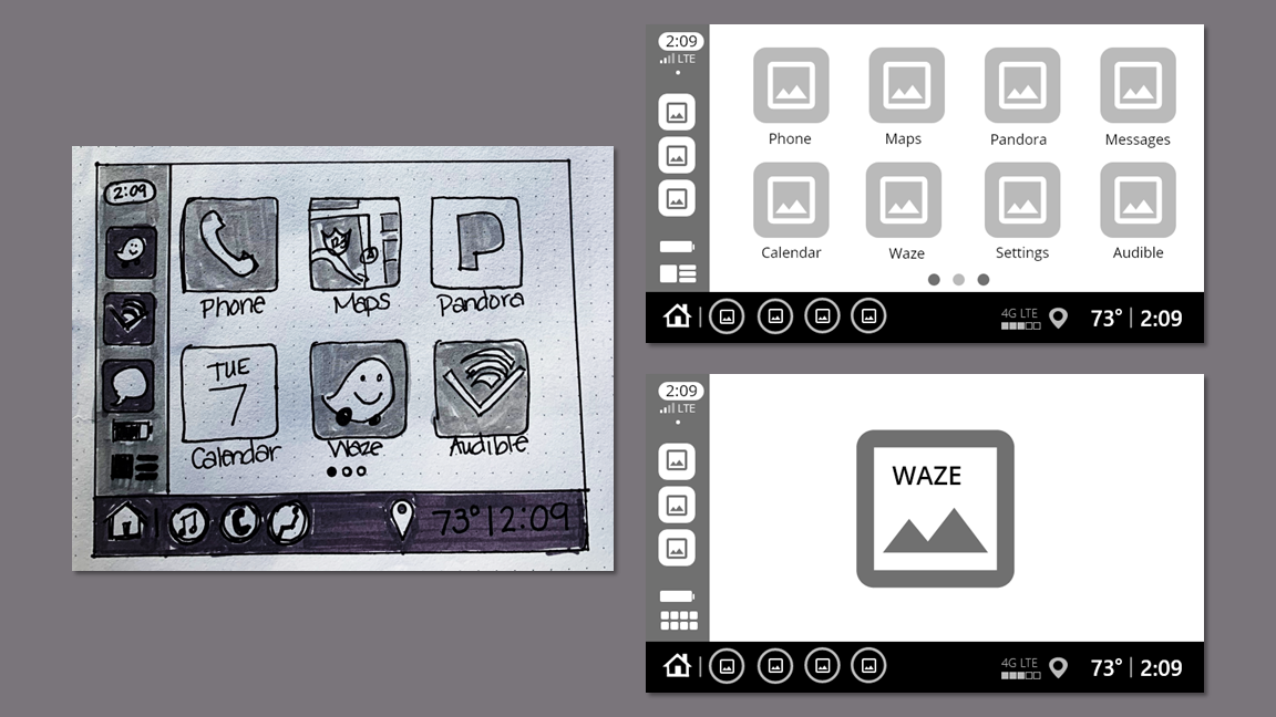
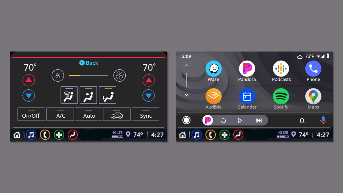
I drew inspiration from the persona's user journey and built out screens for both Audible and Waze in the clickable prototype. I used the footer that appears on the multimedia display in radio mode to solve the problem of switching between the system and CarPlay.
Usability Testing Findings
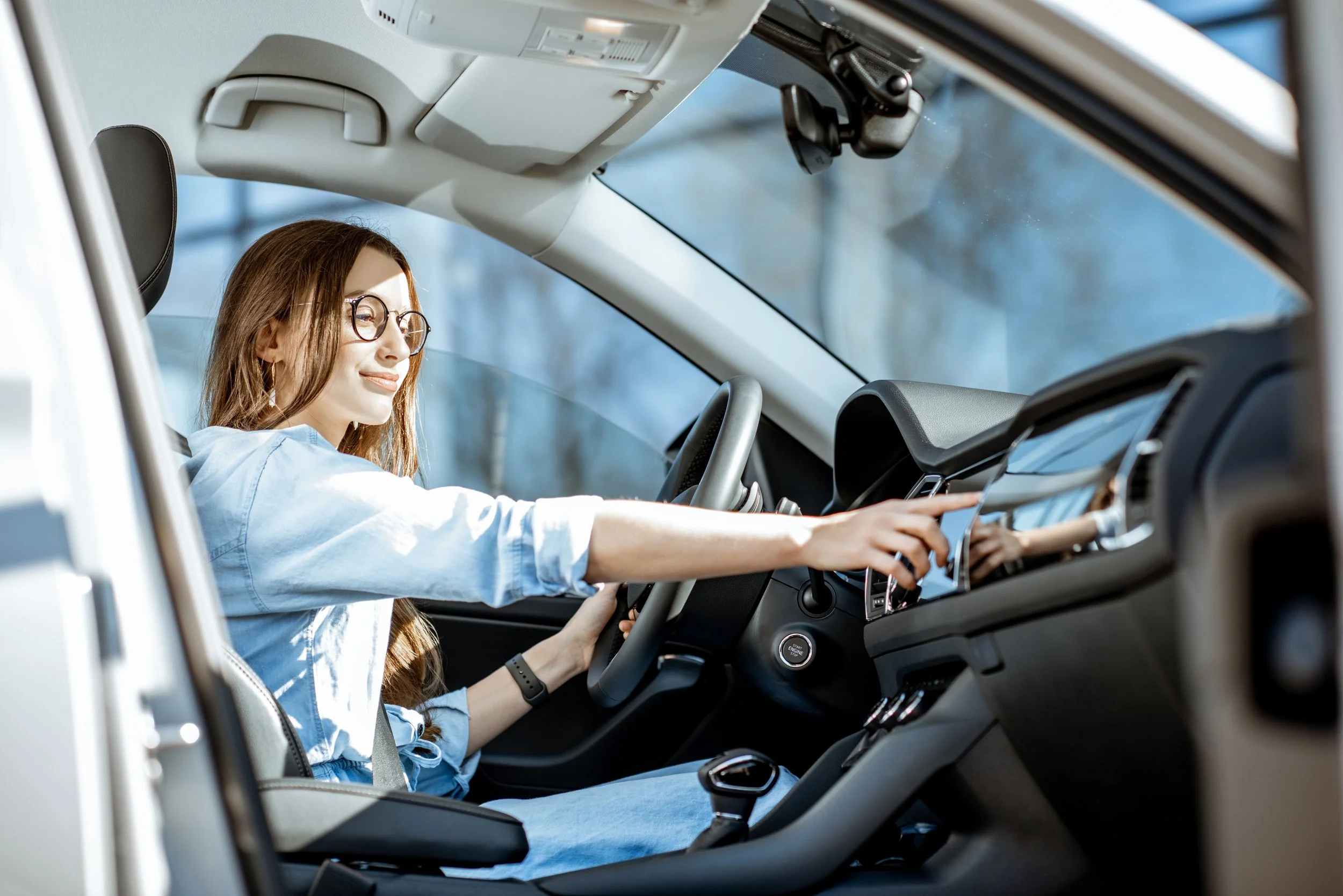
Five participants completed their sessions by sharing their screens over Zoom or Microsoft Teams. Two completed the testing session in person in the driver seat of their Blazer. For this, I attached an iPad to the dashboard over the existing multimedia display to make the experience as authentic as possible.
The participants felt comfortable with the app immediately because it looked and functioned the way they expected.
They appreciated the footer that provided access to the time, temperature and radio.
“Oh my God! I can actually see the time!"
“I can flip between Mojo and Drew and Mike [Detroit radio hosts] and still see Waze.”
”This is so much better than what I have. Are you showing this to GM?”
Accolades
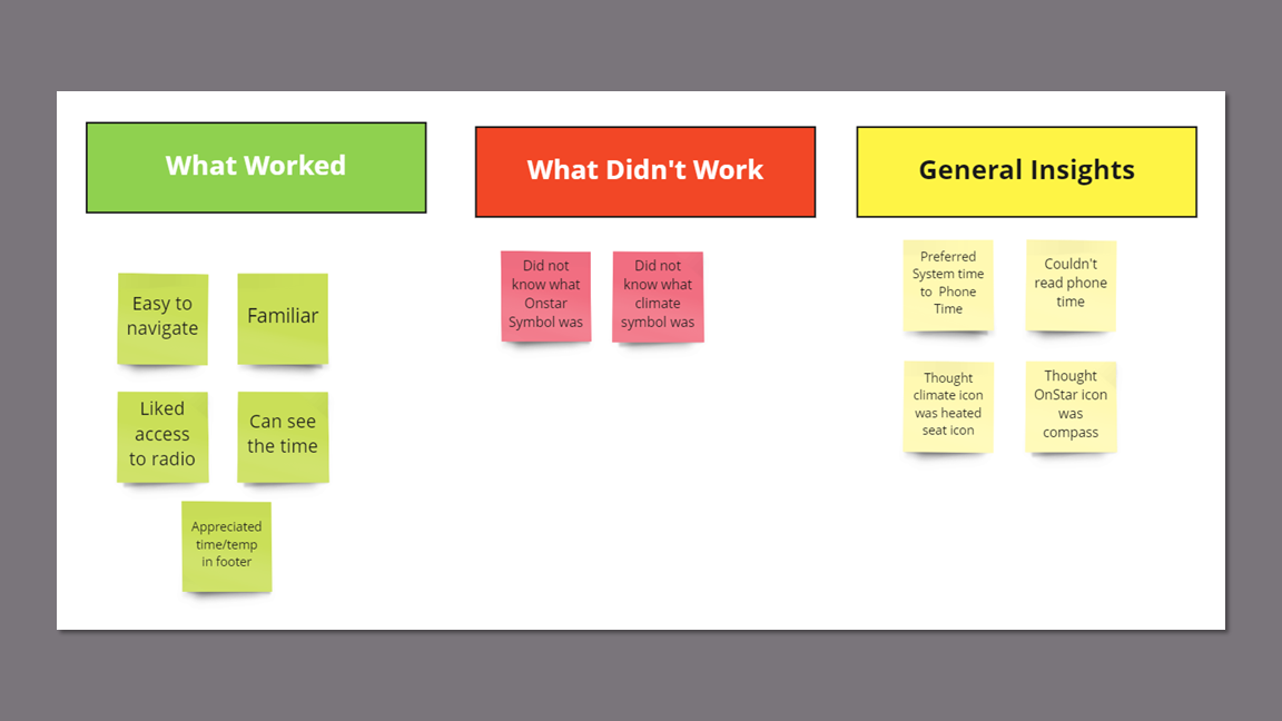
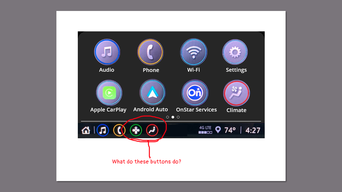
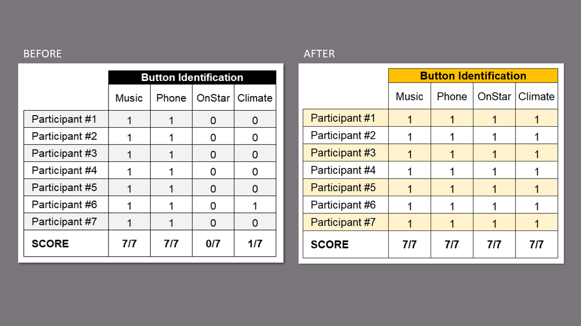
During testing, no one was able to identify the purpose of the OnStar button.
Only 1 participant was able to identify the purpose of the climate button.
Issue
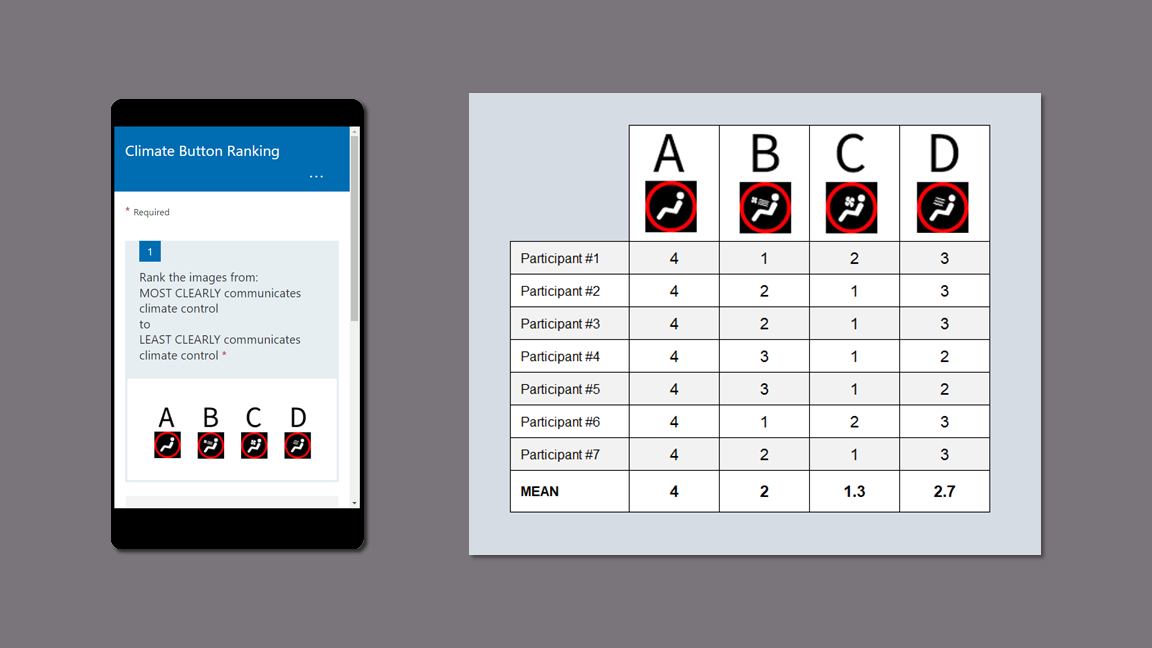
While iterating through designs, I sent the participants a survey with four possible climate button designs which included the original design.
Each participant received a survey with the designs placed in a unique order to account for potential order bias.
I recorded the rankings in a table and found the mean. Design C ranked the highest, so that is what I used.
A/B/n Test
I replaced the OnStar arrow icon with the logo.
I replaced the climate icon with the design that ranked highest overall among the participants.
Response
KPIs
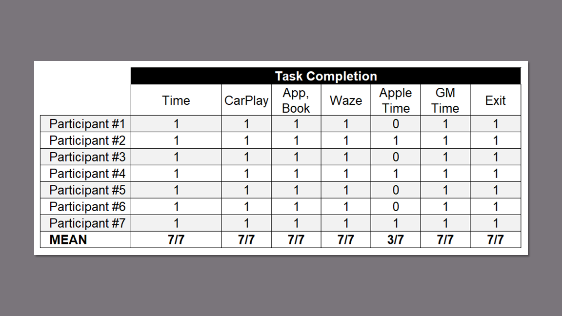
I recorded baseline data for button identification during the first round of usability testing as a baseline comparison for the second round after updating the OnStar and climate control buttons. There was no need for comparison on task completion since the success rate was 100% except for the Apple Time which is part of the iOS and not the multimedia display.
The success rate was high for all tasks except the previously noted pain point of reading the time provided by Apple.
Task Completion
During the first round, only one user was able to identify the climate button and no users were able to identify the OnStar button.
After updating the buttons, all users were able to identify the OnStar and Climate buttons, an overall identification improvement of 46%.
Button Identification
Final Prototype
Climate Control
I added the existing climate control screen to the flow after redesigning the button.
I added a back button to take the user back to the previous screen.
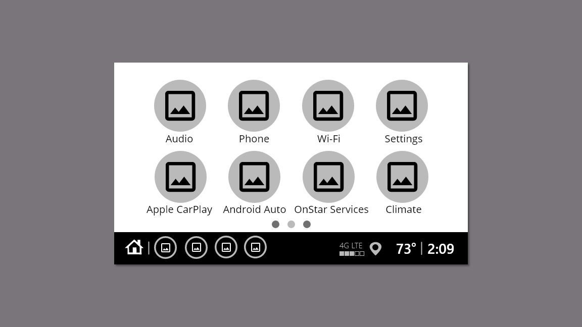
Android Auto
I added the Android home, Pandora, and Waze screens.
Additional Flows
Prototype Video